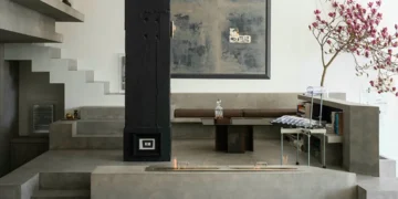



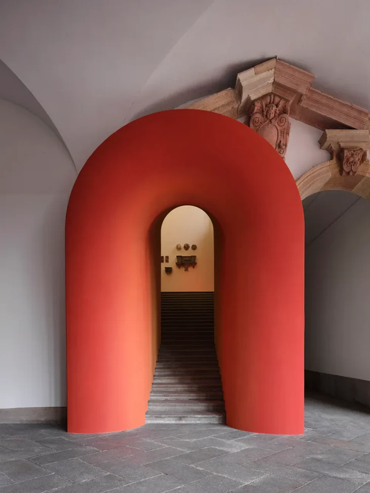
Paint decides showings before the listing photos do. Long before a prospective tenant reads the square footage or scrolls to the rent number, their eye has already moved across a wall, clocked a color, and reached a verdict most people can’t put into words. Landlords who file interior color under cosmetic afterthought, the last thing before the photographer shows up, miss how much of the leasing outcome is already baked into that choice.
The palette isn’t neutral, and neither is the reader looking at it. What follows is a run through the assumptions landlords carry about color, and where each one falls apart under a closer look.
Beige Is Not the Safe Default You Think It Is
The idea that beige offends no one has done more damage to more rentals than any bold color ever did. Beige reads as safe to the landlord holding the paint chip. To a renter walking through, it more often reads as tired, yellowed under warm bulbs, and vaguely institutional.
LATEST INTERIOR DESIGN STORIES
A room-color study by Consumer Reports on how wall color influences perceived value found that specific, considered choices, soft grays in a living room, pale blues in a bathroom, outperformed the reflexive neutral in buyers’ minds. The same logic tracks in rentals, where the first impression is happening on a phone screen at speed. A deliberate neutral is a strategy. A generic beige is a shrug.
White Walls Don’t Photograph the Way You Hope
Landlords reach for flat builder white because it’s cheap, forgiving, and touches up easily between tenants. The problem shows up in the listing photos, which is where the leasing race is won.
Pure white bounces every color temperature in the room and picks up whatever cast the windows are throwing that afternoon. You end up with photos that look blue, green, or dingy depending on the hour. A warm off-white or a soft dove gray holds its own on camera and gives the furniture in the shots something to sit against.
Accent Wall Is Not a Personality Test
Plenty of landlords avoid any color statement because they’re convinced tenants want a blank canvas. Some do. Plenty don’t, and the ones who don’t are the ones who sign faster when a unit feels considered rather than stripped.
A single well-chosen wall, a muted sage in a bedroom, a deep slate behind a headboard nook, signals that someone thought about the space. It also gives the listing photo a focal point the eye can land on. The risk isn’t color. The risk is a bad color, badly cut in.

Bold Rooms Can Cost You Real Money
The counterweight to the accent-wall argument is that certain colors read as expensive to repaint over and hard to live with. Buyers price that in, and renters do too, if only unconsciously through a shorter tour and a faster no. How interior color shapes occupant experience in identical residence-hall buildings, chromatic preference and emotional response varied sharply by hue, meaning the wrong color doesn’t only look wrong, it changes how the room feels to be in.
Practically, that means the palette worth using in a rental is narrower than the one you’d use in a home you’re keeping. A few safer moves worth keeping in the rotation:
- Warm off-whites. They photograph cleanly, hide minor wall wear, and don’t fight whatever furniture a tenant brings in.
- Soft mid-grays. Modern without being cold, and forgiving under both daylight and cheap overhead bulbs.
- Muted greens and blues. Used sparingly in bedrooms or bathrooms, they read as intentional and calm rather than trendy.
- Deep, matte kitchens. A darker lower cabinet or a considered backsplash color can lift a dated kitchen more than a full remodel of the same footprint.
The Same Palette Should Not Run Through Every Unit
Owners with more than one door tend to standardize a palette across the whole portfolio for turnover speed. That saves money on paint inventory and touch-ups. It also flattens units that should be leaning into what makes them different. A garden-level one-bedroom with limited light needs a different treatment than a top-floor unit with south-facing windows. A pre-war building with original moldings can carry a color that would look absurd in a new-construction box.
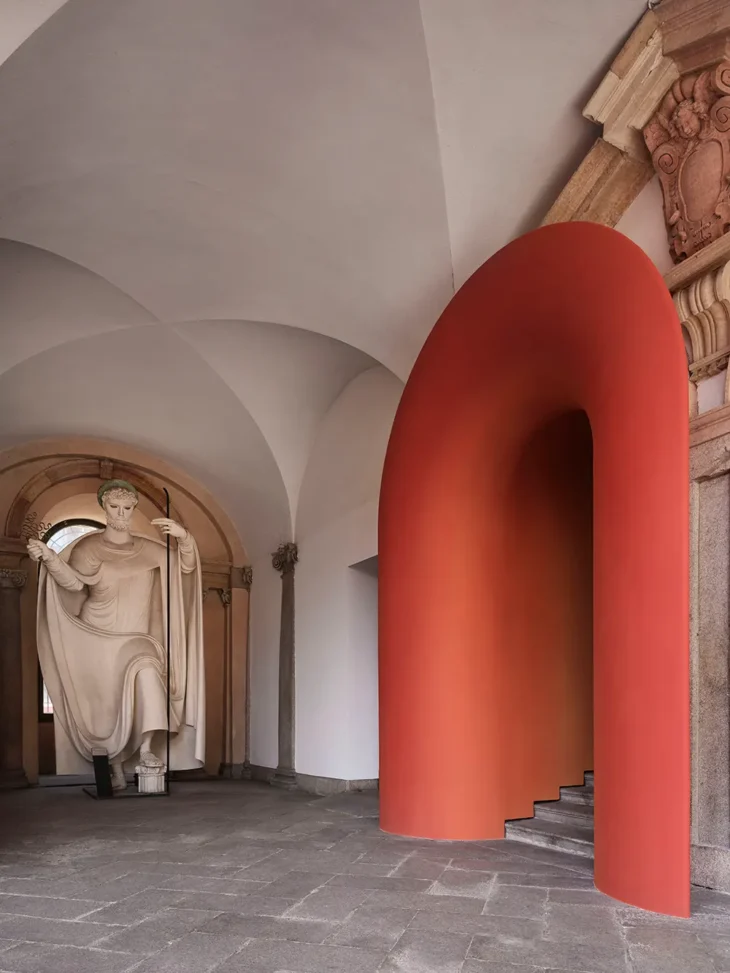
Portfolios large enough to feel the pull of standardization are usually the same ones that benefit most from working with a professional property management team that can tune the palette unit by unit rather than paint everything the same shade of rental. The turnaround discipline stays. The uniformity goes.
One More Thing the Palette Cannot Cover
Older units bring a constraint no color choice can override. In most housing stock built before 1978, existing paint layers may contain lead, and disclosure obligations attach to any repaint decision, not only the aesthetic ones.
Before the roller comes out, confirm what’s already on the wall and what the law requires you to tell an incoming tenant. The palette matters. The substrate underneath it matters more.