


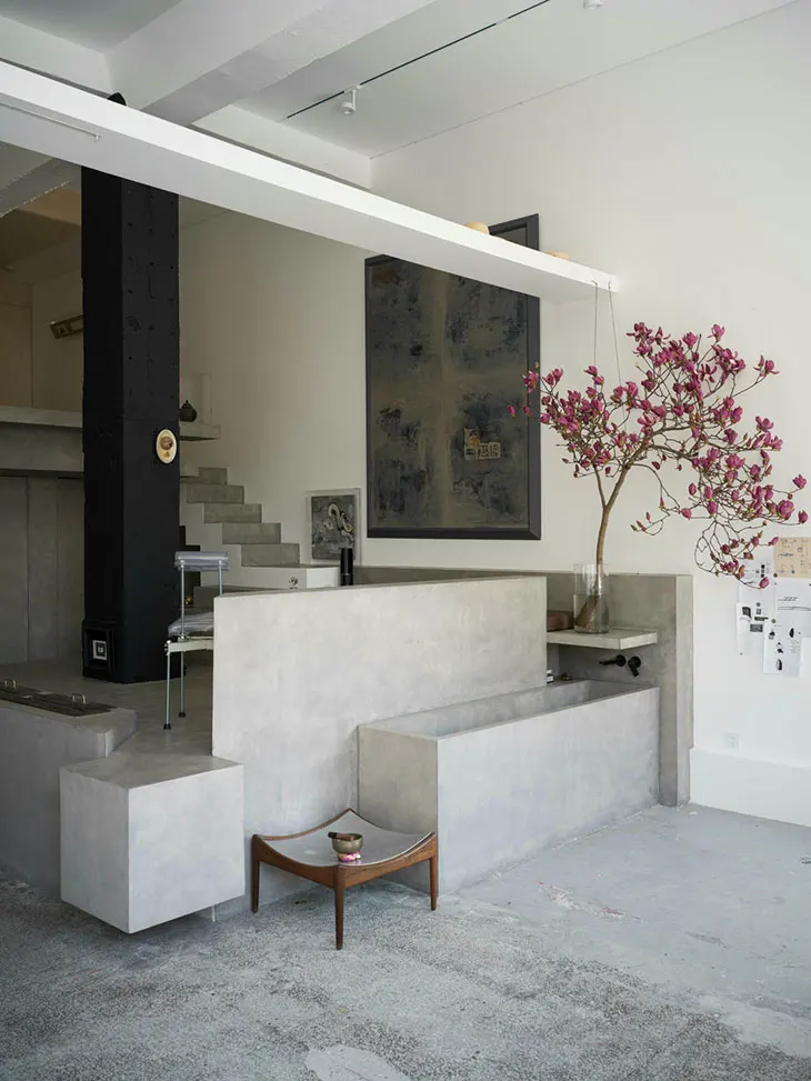
Walk into a creative studio and you can usually tell quite a lot before anyone says a word. The work on the walls, the colours, the way projects are presented , all of it says something about the company. A bare office doesn’t necessarily mean a bad studio, of course. But when clients are coming in for meetings, the space can become part of the presentation.
That is why visual displays deserve some thought. A project image, a branded wall or a simple display panel can show what a studio does without turning the reception area into a sales pitch. The important thing is consistency. The logo, colours, fonts and photography used in the office should make sense alongside the website, social media and printed materials. It doesn’t have to look identical everywhere. It just needs to feel like the same brand.
It also helps to decide what each display is there to do. One might introduce the studio. Another might show recent work. A third could focus on a particular service or client project. Once every wall is trying to say everything at once, the message gets lost.
How Displays Improve Client Visits
A client’s first few minutes in the office matter for any business. While they are waiting for a meeting or walking to a conference room, they are already forming an impression of the design studio. A well-placed display can give them some useful context before the conversation starts. They might see a recent campaign, a packaging project or a selection of branding work. It gives the client something to look at, and sometimes it gives the team an easy way to start a conversation.
There is no need to cover every available surface. A client area might only need:
- a short introduction to the studio;
- a few strong project images;
- key services;
- details about a featured project;
- clear brand elements.
Location shapes everything. A graphic behind reception announces the brand the instant someone walks in. Smaller pieces land better in meeting rooms or corridors, where people actually pause long enough to absorb them. Text follows the same logic. Long blocks of copy don’t work on walls. If someone has to stand there decoding what they’re looking at, you’ve already lost them.
How Visual Displays Present Creative Work
Most agencies have more work than they could ever put on a wall. There may be branding projects, packaging, websites, campaigns, photography, video and product work sitting in the portfolio. Choosing what to show is therefore more important than finding enough material. One useful approach is to give the portfolio some order. Work can be grouped by service, industry or project type. This makes it easier for a visitor to understand why particular examples have been selected.
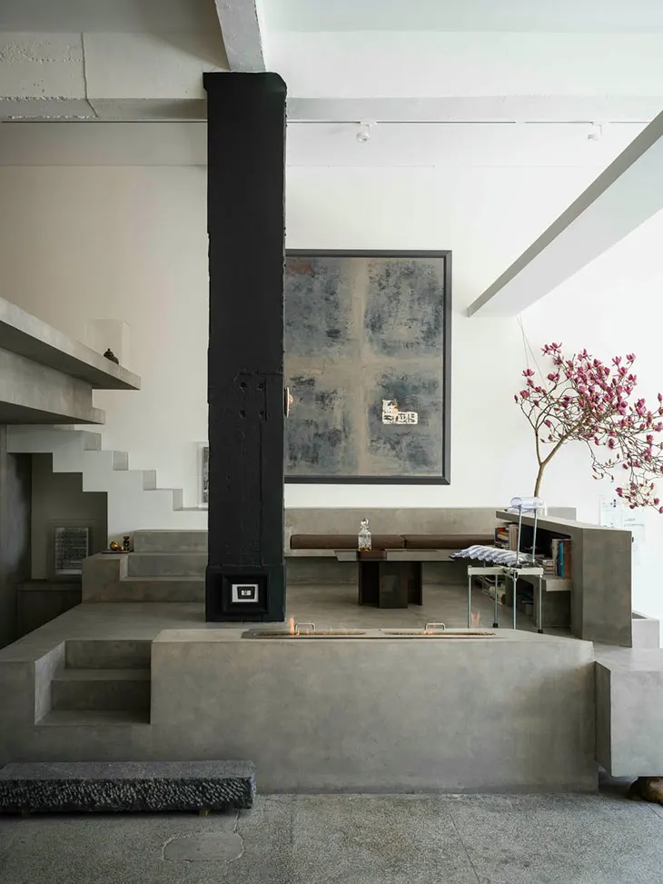
Size matters as well. A detailed packaging design won’t say much if it is printed as a tiny image in the corner of a display. Large project images give visitors a chance to see the work properly. A short caption can fill in the gaps with the project name, service or industry. A Seg frame is one option for presenting large fabric graphics in a clean format. It can be particularly practical for studios that change their portfolio from time to time, since the printed graphic can be replaced without changing the whole frame.
Before choosing a project, ask:
- Does it show a skill the studio wants to be known for?
- Will it still look good at the planned size?
- Does it relate to the kind of clients the studio wants to attract?
It is worth asking these questions regularly. A project that looked impressive three years ago may no longer represent the studio’s current work. That doesn’t mean old work has to disappear, but it shouldn’t necessarily dominate the display. There is another simple point that is easy to miss: leave some empty space. When every part of a wall is covered, individual projects can start competing with one another. Giving each piece some room makes the whole display easier to read.
And a physical portfolio doesn’t need to tell the entire story. For a digital project, the wall might show the finished work and a few key details. The full case study can then be opened on a screen during the meeting.
How Flexible Display Systems Support Creative Work
Creative studios change. New clients arrive, campaigns finish and old projects move down the portfolio list. A display system that works well today may need to show something completely different six months from now. This is one reason flexible and modular systems can make sense. Rather than rebuilding the whole display each time the content changes, the studio can keep the basic structure and update selected parts.
For example, a studio might use the same system to:
- add a new project;
- remove an older example;
- prepare a client presentation area;
- create a display for an event;
- change the size or layout of a space.
Fabric graphics are useful in this situation because the frame can stay where it is while the printed graphic changes. A studio can therefore use the same display structure for different projects or messages. That doesn’t mean every modular system will suit every space. Measurements, graphic specifications and installation all need to be checked beforehand. A flexible display is only useful if it fits properly and looks good once installed.
Still, the ability to update the content without starting from scratch can make day-to-day changes much easier.
How Light and Colour Affect Creative Spaces
Designers know this instinctively, but clients often don’t: the colour that reads perfectly on your monitor shifts the moment it hits office fluorescents or natural daylight. Printed photos and graphics behave the same way. What works in the design file and what works on the wall are two different conversations. Backlighting solves this in certain situations. When you need a large graphic to command space, in a reception, a meeting room, a gallery, somewhere people view it from across the room, backlighting cuts through ambient light and forces attention. It’s a tool, not a default. Use it when the distance or the brightness in the room demands it.
Contrast is non-negotiable. WCAG sets the standard at 4.5:1 for body text, 3:1 for larger text, those are digital guidelines, but the principle translates to walls: text has to read. Dark text on light, light text on dark. No exceptions based on what looks elegant on screen. This is why proofs matter. Before a large graphic goes to print, see it in the actual space. A physical proof catches colour shifts and production problems that vanish on a monitor. Once it’s printed, there’s no second take. The investment in that one preview step pays for itself the moment you avoid a reprint.
How Displays Support Agency Presentations and Events
Agencies live in two worlds: the studio and the event floor. Conferences, exhibitions, product launches, client dinners, these are spaces where your display competes with noise and movement and fifteen other booths fighting for attention. The constraint is brutal: you have maybe five seconds. The hierarchy has to be airtight. One dominant image or message, then secondary information underneath or beside it. Everything else is clutter.
The execution depends on what you’re working with. Fabric graphics read cleanly from a distance. Framed panels give structure. Lightboxes cut through low light. The choice tracks with the space itself, the event type and how often you’ll need to use the system. For agencies doing the circuit, multiple events annually, modular systems earn their weight. A consistent frame structure that accepts different graphics means you’re not reinventing the wheel each time. The skeleton stays recognisable. The content rotates.
The Principle
Strip away the complexity and a good display does one thing: it lets people understand the brand and the work without friction. A few decisive projects, clean spacing, consistent identity, graphics you can swap when needed. That always beats a wall packed solid edge to edge.
The display isn’t the work itself. It isn’t the conversation with a client. It’s the threshold. It’s what makes the conversation possible.