


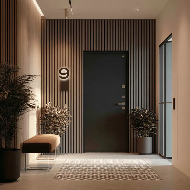
Hallways can present a decorating challenge. They connect beautifully styled rooms yet sometimes look as though the decorating stopped at the doorway. Paint color helps, and a good runner rug can bring the space together. One detail that often escapes attention, however, appears on the doors themselves. Door numbers and room labels frequently remain unchanged for years, whether they came with the original building or arrived as a quick replacement from a hardware shop.
A closer look may reveal that they have little connection to the rest of the interior. Their material, finish or lettering can feel out of place in an otherwise coordinated space. Replacing them offers a small update that can make a noticeable difference.
Why This Works
In interiors, repeated details help create a cohesive look. Matching drawer pulls connect kitchen cabinets, while consistent light switch covers give walls a uniform finish. Door signs can serve a similar function.
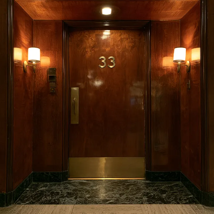
In an apartment building, a consistent door number design can give the hallway a coordinated appearance through matching materials, mounting heights and typography. The same principle applies to a single home. Numbered rooms, a home office or a guest room can benefit from signs that suit the surrounding interior. Their size, material and lettering all contribute to the result.
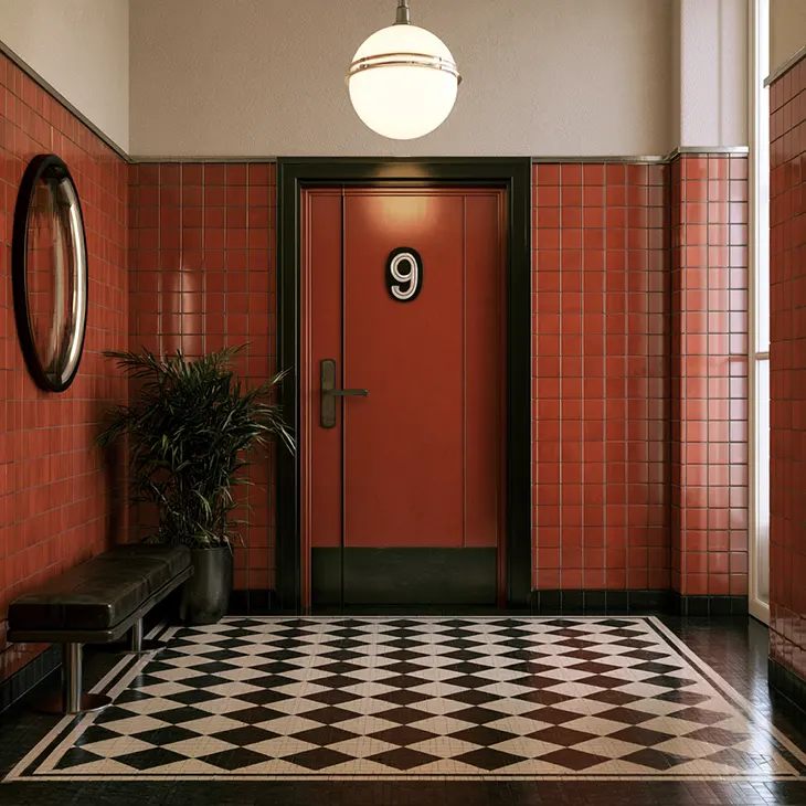
Matching Materials to Your Interior Style
Different materials create different effects, so choosing door numbers can follow the same approach as selecting hardware or accessories.
Before choosing a finish, look at the details already present: door handles, hinges, lighting and nearby furniture. A sign can repeat one of those finishes or introduce a complementary texture. Consider its proportions alongside the door panels so the overall arrangement feels balanced.
For warm, natural interiors, a light wood sign with simple numbering complements rattan and linen tones. It works well with Scandinavian, Japandi or cottage-inspired decorating schemes.
For modern or monochrome spaces, matte black acrylic with white lettering offers a clean finish. It suits hallways with strong wall colors or pared-back furniture.
For contemporary interiors, stainless steel introduces a polished metallic detail. It pairs well with chrome hardware and cool-toned palettes.
For layered, textural schemes, a sign that combines wood with a metal or acrylic overlay adds depth. In a home that already mixes materials, this approach extends the same styling to the doors.
Where This Works in a Home
Door labels can help in homes of different sizes. Useful applications include:
- A guest room label that helps visitors find their way, especially when bedroom doors look identical.
- A home office sign that helps establish a boundary between work and living space.
- A personalized sign that gives children a sense of ownership of their room.
- A utility cupboard or storage room label that makes the right door easier to find.
- Clear room identification in a rental property or guest house.
Choose labels where they offer a practical benefit or contribute to the decorating scheme. Consistent placement and finishes can help connect them visually. This also makes future additions easier to coordinate.
The Practical Side
Door numbers may use adhesive tape, small standoff mounts or screws, depending on the product. Adhesive options can simplify installation, while screw-mounted signs provide a more permanent fixing. Check the manufacturer’s instructions and the door surface before choosing a mounting method. Standoff mounts may require drilling, and adhesive removal can leave residue or damage some finishes. For renters, compatibility with the existing surface matters particularly. Confirm any installation restrictions before attaching a sign, and check how the adhesive should come off.
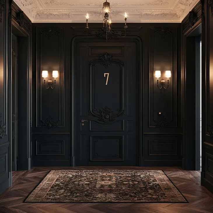
Before fixing signs in place, compare their placement on each door. Check how they look from both ends of the hallway and under the lighting you normally use. Consistent spacing helps the signs feel connected, particularly along a corridor with several doors. The typeface also affects the overall look. A clean sans-serif suits a modern interior, while rounded or slightly playful lettering can work for children’s rooms. Choose lettering that remains easy to read and fits the other details nearby.
Like replacing dated cabinet handles or a light fixture, updating door numbers can help a hallway feel more finished. A consistent design, suitable material and appropriate mounting method make this small detail part of the overall interior.