


Digital wellness has developed a recognisable visual language. Pale gradients, natural imagery, soft typography and generous empty space signal that an experience is intended to feel calm. Yet beneath that surface, many products still follow the familiar structure of the wider app economy: dashboards, category menus, progress trackers and expanding libraries of content.
These patterns make large amounts of information easier to organise, but they can also turn a short pause into another navigation task. Before an experience begins, the user may need to select a goal, compare formats, estimate the time available and decide what feels appropriate for the moment.
A different direction is beginning to emerge. Instead of treating wellness as content to browse, some products are approaching it as an environment to enter for a defined period of time.
When the Interface Becomes a Setting
A conventional interface communicates through buttons, labels and instructions. A designed environment can also use light, depth, scale and movement to establish direction before the user reads anything.
Real-time graphics make this environment responsive. Forms can change as a session progresses, light can mark a transition, and motion can give attention a clear point to follow. The screen stops functioning only as a container for information and begins to shape the experience itself.
This approach draws from gaming, interactive art and spatial design, but applies those tools with a different rhythm. The goal is to create a controlled sequence in which visual changes have a specific role.
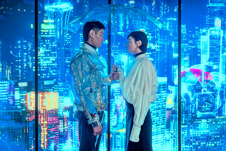
Sound as Part of the Architecture
A convincing sense of place cannot be created by imagery alone. Spatial audio gives sounds direction and distance, while binaural techniques can add depth when experienced through headphones. Used carefully, sound can introduce a transition, draw attention towards movement or connect different parts of a session without adding another visual instruction.
This changes the role of audio. It is no longer simply a soundtrack placed behind the interface; it becomes part of the product’s structure. Silence, proximity, movement and texture can all contribute to the way the experience develops over time.
The same principle applies to motion and haptic feedback. A physical gesture can guide the user through a transition, while a tactile response can make a change perceptible beyond the screen. Each layer has its own function, but the experience only feels coherent when those layers follow the same pace.
Complex Systems, Simple Experiences
One example of this direction is ASHR, an interactive digital wellness product built around five-minute guided resets. Its sessions combine real-time 3D created in Unreal Engine 5 with spatial and binaural audio, breathwork, motion and haptic feedback.
Rather than presenting these technologies as separate features, the strongest experiences coordinate them around a defined beginning, progression and end. The technical complexity remains within the product, allowing the user to engage with the experience without having to manage additional menus, controls or settings.
This distinction is important. Simplicity does not necessarily mean using less technology. It can also mean allowing several advanced systems to work together without requiring the user to manage each one.
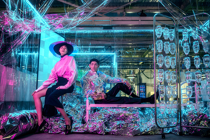
Time as a Design Material
Once an experience has a fixed duration, time becomes part of its architecture. The opening needs to establish the setting quickly, the middle has to hold attention without introducing unnecessary decisions, and the final moments need to bring the progression to a recognisable close.
A five-minute format is therefore not simply a shorter version of a longer session. It requires its own structure. Visual, auditory and tactile changes must support the same arc rather than continue indefinitely.
This finite structure also changes the relationship between the product and the person using it. The experience is designed to be entered, completed and left behind. A clear ending becomes a design feature rather than an interruption to engagement.
Calm Does Not Have to Look Empty
Digital calm is often represented through stillness: muted colours, static landscapes and minimal movement. Those choices remain effective, but their widespread use has also made much of the category visually interchangeable.
Responsive environments suggest another possibility. Calm can be created through coordination rather than visual absence. An image may move, sound may develop and several systems may respond at once, while the overall composition remains controlled and easy to follow.
This creates a more active visual language for wellness, one that belongs specifically to the digital medium instead of imitating a physical retreat or reducing the experience to a static breathing timer.
A Medium Finding Its Own Form
Digital wellness has spent years borrowing structures from content platforms, fitness trackers and productivity tools. The move from interface to environment suggests that the category may be starting to develop a more distinctive form of its own.
The most meaningful question is not simply how immersive a product looks or how many technologies it contains. It is how precisely those technologies work together, how much effort the experience asks from the user and whether its progression feels complete.
When visuals, sound, movement, touch and time follow the same logic, the result can feel less like another platform waiting to be explored and more like a temporary place with a clear purpose.
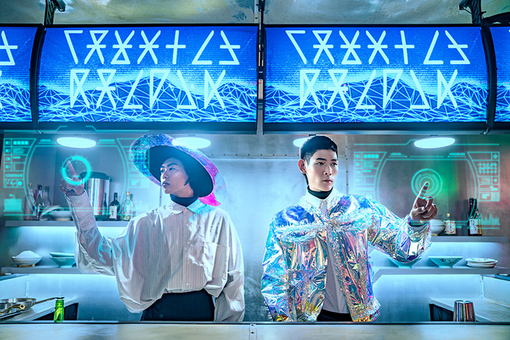
Images for Remember Me by Michelle Lau – See the full story here.