


![]()
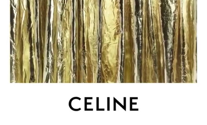
French luxury label CELINE has introduced its new logo on Instagram yesterday. Removing the accent on the “E” and tightening the spacing between the letters, the new logo is an homage to the original CELINE design from the 1960s with a modernist typography from the 1930s. Clearing all the images posted under former Creative Director Phoebe Philo, the label is presenting its new look, making the room for newly-appointed artistic, creative and image director Hedi Slimane.
The new logo has been directly inspired by the original, historical, version that existed in the 1960’s. The modernist typography used dates from the 1930’s. The accent on the “e” has been removed to enable a simplified and more balanced proportion, evoking the CELINE collections of the 1960’s where the accent wasn’t used often. The spacing between the letters has been evened out and the letters have been brought closer together. The use of “Paris”, which historically was also very prevalent, is to be reinstated in the new packaging concept and will be found on all boxes and bags but also on the labels within the new collections. The use of “Paris” will however not exist on the publicity campaigns entitled “CELINE”. – from CELINE
Recently, Lady Gaga showed off Hedi Slimane’s first bag for CELINE, see below:
![]() @ladygaga
@ladygaga


