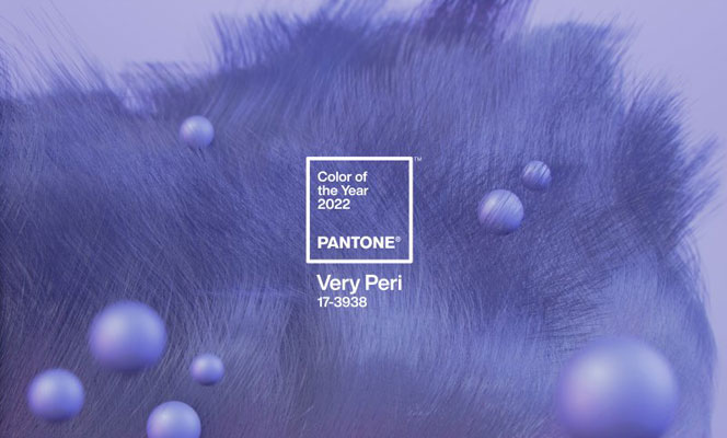


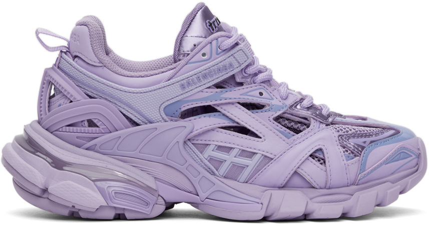
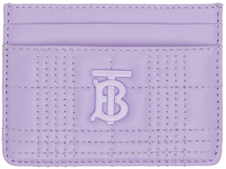
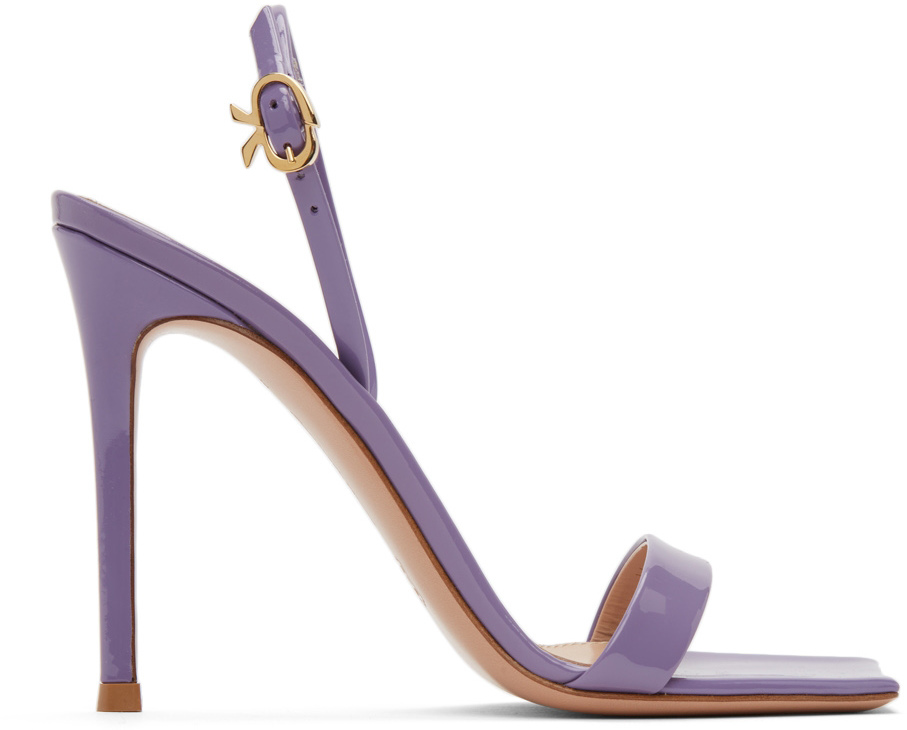
The Pantone Institute has created a brand new color for the first time in the history of Pantone’s Color Of The Year. Named PANTONE 17-3938 Very Peri, the color is symbol of the global zeitgeist of the moment and the transition we are going through.
DESIGN
For 23 years, Pantone’s Color of the Year has influenced product development in multiple industries, including fashion, home furnishings, and industrial design. PANTONE 17-3938 Very Peri displays a spritely, joyous attitude and dynamic presence that encourages courageous creativity and imaginative expression, encompassing the qualities of the blues, yet at the same time possessing a violet-red undertone.
We earn a commission when you follow the link to make a purchase. Click here to learn more about how we make money.
The Pantone Color of the Year reflects what is taking place in our global culture, expressing what people are looking for that color can hope to answer. Creating a new color for the first time in the history of our PANTONE Color of the Year educational color program reflects the global innovation and transformation taking place. As society continues to recognize color as a critical form of communication, and a way to express and affect ideas and emotions and engage and connect, the complexity of this new red violet infused blue hue highlights the expansive possibilities that lay before us.
– said Laurie Pressman, Vice President of the Pantone Color Institute.
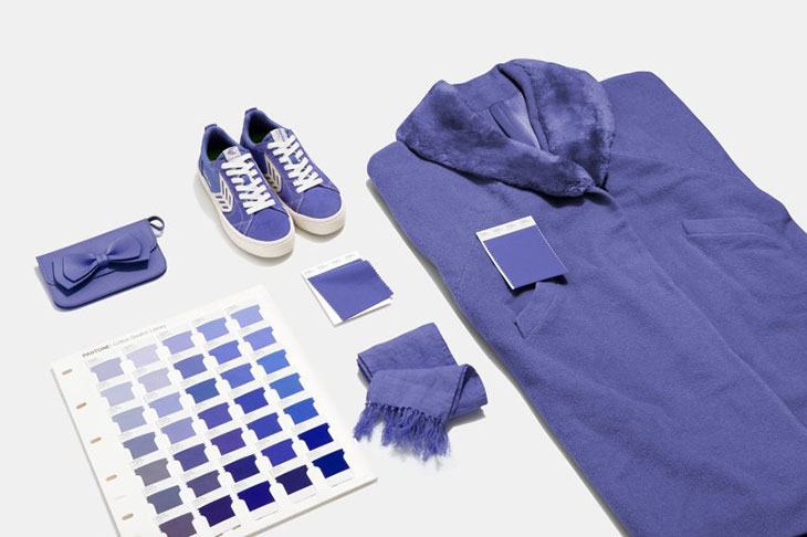
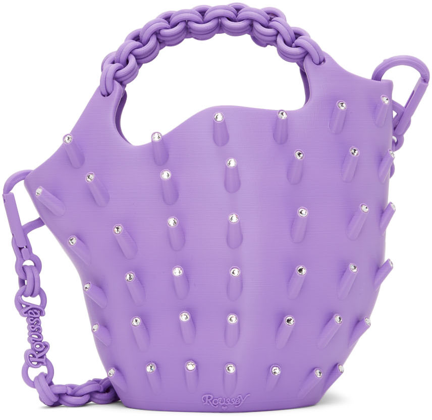
SHOP PANTONE’S COLOR OF THE YEAR:
![]()
![]()
![]()
![]()


