


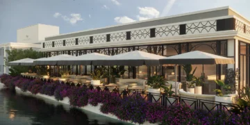
While real estate is a great way to create wealth and earn passive income, there’s also a catch. Your success chiefly depends on keeping your tenants happy and making the right choices. One seemingly small choice that can have a big impact is selecting the best paint color for your rental property.
Choosing the perfect color often feels like going through a whirlwind of swatches and templates. As numerous as samples can be, landlords often face twice the trouble since they have to choose what will work for someone else’s taste. Feeling overwhelmed with the pressure to make the right color choice for your rental property? Ultimately, first impressions matter, and the paint color can serve to attract, or repel qualified leads. That said, if you’d like your rental to stand out, take note of the following tips.
Invest in Durability
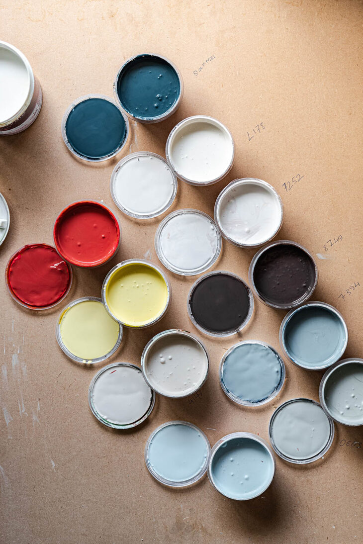
One of the most intelligent paint trends for rental properties is the importance of high-quality materials. After all, there’s no point spending money on a versatile off-white or inviting beige if you can’t tell them apart after a few years. If you want the long-lasting effect of making the right choice, you have to invest in durable paints.
Upfront, higher-quality brands might seem more expensive, but they’re a lot more cost-efficient in the long run. Aside from the fact they retain their color longer, they also offer more coverage. In other words, you can get more out of one bucket than with a lower-quality one. This is especially important in a rental since the higher turnover rate means walls often take a beating.
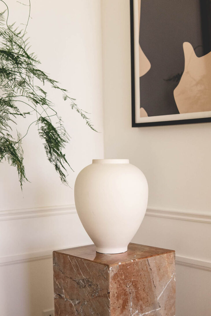
Stay Neutral
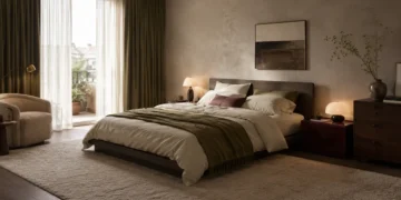
First and foremost, when painting a rental property, sticking to neutral tones is key. Neutral colors withstand the test of time because they appeal to everyone and help disguise minor imperfections. While more drastic colors can add a touch of drama, in a rental, it is important to provide a blank slate for incoming renters. However, it’s also essential to consider the wall’s texture, room lighting, and furniture (if applicable) before choosing. If you are unsure what might be the best option, check with your property manager before painting. They can offer advice on selecting popular tones that always hit the mark such as grey, beige, or off-white.
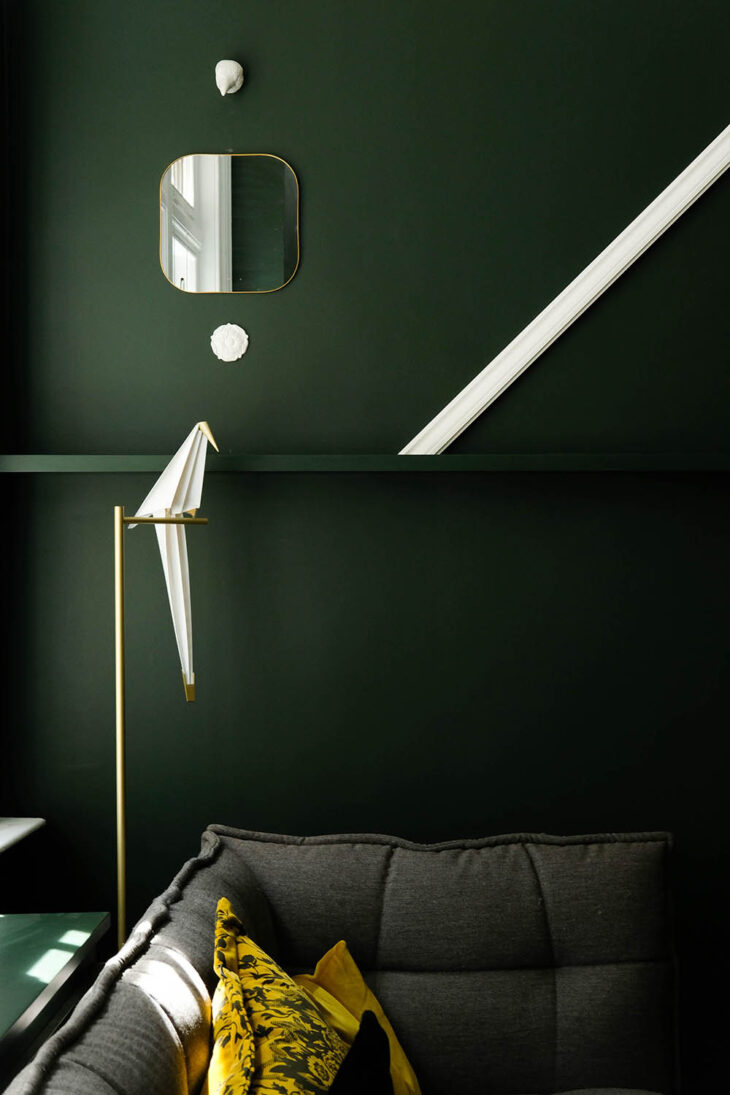
Keep It Close to Nature
If you’d rather avoid the cliche of white walls while still playing it safe, consider warm earthy tones. While these colors offer more saturation and intensity, the natural hue has a calming feel that appeals to most people as much as any neutral color. Besides, they typically blend well with any furnishings. If you’d like to stick closer to the muted end of the spectrum, check out options like terracotta or bronze. However, if you want a bit more pop, you can opt for green tones like jade or sage.
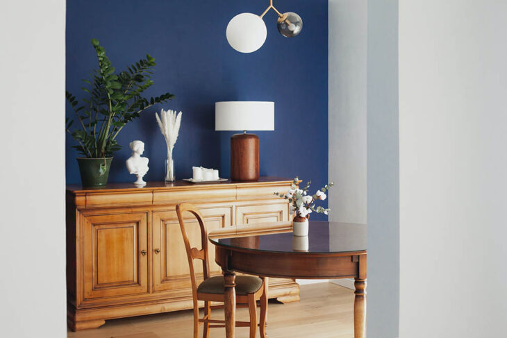
Stay Cool with Blues
In 2020, the world saw a mass increase in the prevalence of anxiety and depression during the pandemic. Since colors are well-known to influence our mood, why not use color to create a relaxing oasis for your tenants.
Pale shades of blue and sea evoke the feeling of safety and calmness. Thus, incorporating it into your rental design can improve the occupant’s mental health. Imagine inducing feelings of relaxation in prospective renters when they walk through the front door. They’ll be lining up to apply with the first month’s rent in tow. Opt for calming shades of aqua and peacock tones for the best effect. Also, dusty blue is a classic that works well with almost any decor style.
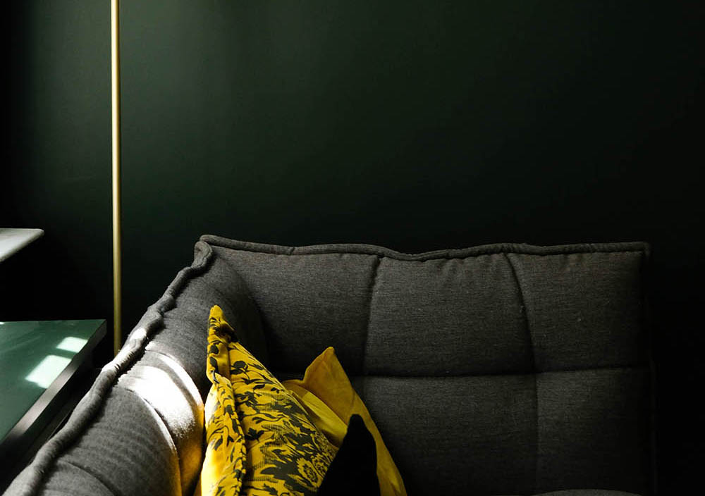
Get Vibrant with Bright Colors
In contrast to soothing neutrals and calming hues, shaking things up with a brilliant pop of color is an emerging trend in 2022. Like the heydays of the 50s, bright colors seem to be making a comeback in a big way. Many people enjoy the energetic tones of a bold red or fun yellow. However, that doesn’t mean that anything goes.
Bright colors are not always well suited to rental property as they do not suit everyone’s taste. In addition, these dramatic hues often show wear more easily. Therefore, use these colors sparingly in an area that does not see a lot of traffic, such as a bathroom or accent wall in a bedroom.
If you do opt for such a bold choice, then think retro vibes to stay on-trend. Look for muted tones that evoke nostalgia due to their vintage feel such as tomato red, pastel pink, or butter yellow.
Conclusion
Making crucial interior design decisions for a space someone else will call home is daunting. While you don’t want your units to look too basic and boring, you also don’t want them to be loud and tacky either. Thus, it would be in your best interest to play it safe by following these top 2022 rental property paint trends.
Remember that neutrals are your safest choices because of their appealing nature. However, if you’d like to mix it up, tasteful nature tones and selectively bold colors are the way to go. Of course, you’ll only get the best results if you invest in durable paints. Finally, if you need help with getting a contractor, supervising the project, or other daily operations, consider hiring an expert to help.
