


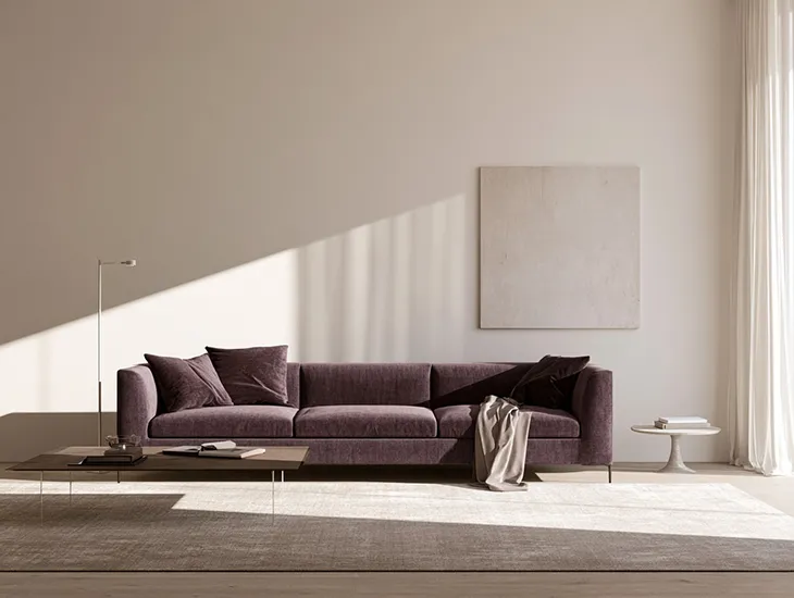
Purple has long carried associations with status, ceremony and creative expression. Its meaning changes with every shift in shade, material and setting. Pale lilac may give a room a softer atmosphere, while deep plum can add intensity to a fashion image. Violet flowers create a different impression from aubergine velvet or glossy purple packaging. Designers, florists and brands use these variations to shape how people experience an object, space or image before they consider its details.
The color’s history explains part of its visual authority. Ancient producers created Tyrian purple from secretions taken from Mediterranean sea snails. The process required extensive labour and large quantities of raw material, making the dye rare and expensive. Rulers, religious leaders and wealthy patrons used purple textiles to communicate rank and ceremonial importance throughout several ancient Mediterranean societies and the Byzantine Empire.
Access changed during the nineteenth century. British chemist William Henry Perkin discovered mauveine in 1856 while attempting to synthesise quinine. His synthetic dye allowed manufacturers to produce purple textiles at a much greater scale. Colors once associated with privilege entered popular fashion, printed fabric and domestic decoration. Purple kept its connection with ceremony, while new uses linked it with experimentation and individual taste.
Reading Different Purple Shades
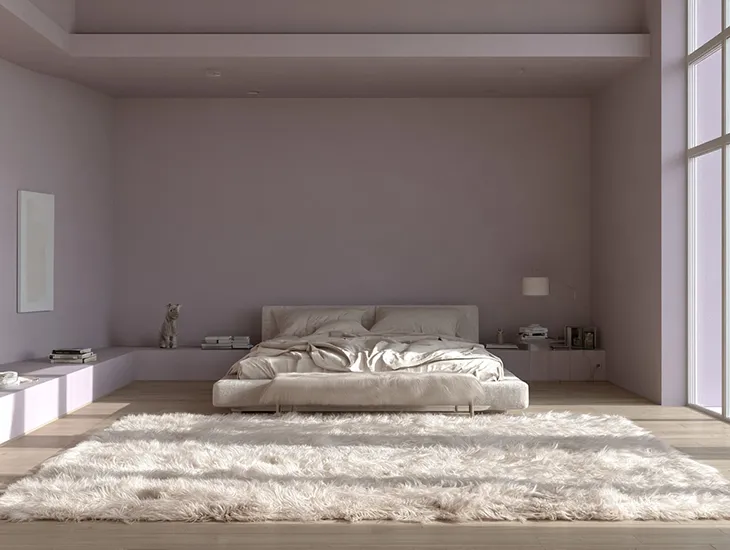
Lavender, lilac and mauve create the lightest readings within the purple family. Their pale appearance often suits interiors, packaging and floral arrangements that seek a gentle or intimate quality. A lilac wall can soften a bedroom, while lavender paper can give fragrance or skincare packaging a delicate finish. White, cream and pale green can make these shades feel clearer and lighter.
Violet, orchid and amethyst create a stronger visual presence. Fashion and beauty brands often use these shades to attract attention while maintaining a polished character. They work well with charcoal, silver, dark brown and muted green, though the surrounding palette can make them appear cooler or warmer.
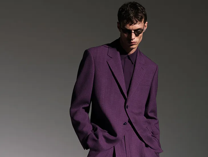
Plum, mulberry and aubergine bring greater density. These shades gain depth on velvet, satin, lacquer and polished leather because each surface reflects light differently. Matte paint, paper and wool absorb light and produce a heavier effect. The same dark purple can appear theatrical on silk and restrained on a structured coat.
Purple in Floral Design and Gifting
Florists use purple tones to establish the mood of an arrangement. A purple flower bouquet can range from formal to delicate depending on the flowers and tones selected. Violet calla lilies, lisianthus and dark dahlias create a denser arrangement, while lavender roses, sweet peas and freesia give it a lighter character. Mixing dark and pale flowers adds contrast, while green foliage gives the composition structure.
Flower type also changes the impression. Orchids can bring a sculptural quality, while lilac stems create a looser seasonal arrangement. A monochrome bouquet directs attention toward shape and texture. Cream, blush or green additions soften the color and make the arrangement feel less formal.
Purple works well for gifting because it can suit several occasions without relying on the familiar codes attached to red, white or yellow flowers. A deep violet arrangement may suit a formal event, while lavender tones can work for a birthday, personal gesture or intimate dinner. The recipient’s preferences should guide the selection. Choosing a shade that reflects their style makes the gift feel considered.
Purple in Interior Design
Scale plays an important role when purple enters an interior. Deep plum on every wall can make a small room feel enclosed, particularly when natural light remains limited. Used on one wall, an upholstered chair, curtains or a rug, the same color can add depth while leaving space for lighter materials.
Lavender and muted mauve suit bedrooms, dressing rooms and reading areas. Darker shades can bring warmth to dining rooms, libraries and hotel interiors. Brass, dark wood, stone and cream textiles work particularly well with plum and aubergine. Linen and plaster soften purple, while mirrored surfaces and lacquer increase its intensity.
Lighting can change the result throughout the day. Lilac may appear cool in morning light and warmer under evening lamps. Dark purple can feel rich in a bright room and heavy in a space with limited light. Designers therefore consider the color alongside orientation, materials and the room’s function.
Branding and Fashion
Purple gives brands an alternative to the blues, reds and blacks that dominate many visual identities. Electric violet can suit entertainment, and digital platforms, while muted mauve often appears in beauty, fragrance and editorial design. Typography and packaging materials determine whether the color reads as playful, refined or experimental.
Fashion reveals how strongly material shapes purple. Satin reflects light and gives violet a fluid appearance. Velvet intensifies darker shades, while wool creates a denser and more structured effect. Mulberry, wine and red-based purples tend to feel warmer, while blue-based violets appear cooler.
Purple works best when designers treat it as part of a complete composition. Shade, texture, proportion and surrounding colors define its effect. In flowers, interiors, branding and clothing, purple communicates through the details around it. Those details give the color its range and explain why it continues to hold such a distinctive place in visual culture.