


For a long time, purple was the color that serious interior designers quietly avoided. Too risky. Too maximalist. Too much. The decade of greige, that long beige-grey reign that made half the homes in the Western world look like upscale hotel lobbies, had no patience for it.
That era is over.
Purple has made a full aesthetic comeback, and it’s arrived with considerably more sophistication than its previous incarnations. This isn’t the mauve of the 1980s or the aubergine feature wall of the early 2000s. The current wave of purple in interiors draws from fashion’s ongoing obsession with the color – from the dusty lilacs and plummy violets of recent runway seasons to the deeper, more complex shades that have been creeping into art world interiors and high-end residential projects alike.
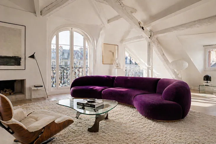
Nowhere is the shift more visible than in upholstered furniture. A purple sofa, once a statement so bold it bordered on provocation, has become something genuinely covetable – a centerpiece around which a considered, confident room can be built.
The challenge, of course, is the building.
Understanding What Purple Actually Is
Before approaching a room around a purple sofa, it helps to understand that purple is not a single thing. The spectrum runs from pale lavender (almost a neutral in the right context) through mid-toned violet and mauve to the deep, saturated shades of amethyst, plum, and eggplant. Each of these registers differently in a space, interacts differently with light, and calls for a different supporting palette.
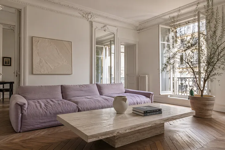
A dusty lilac sofa in a sun-filled room reads almost like a soft neutral – it can be treated with similar restraint, paired with whites, warm creams, and natural textures, without the room feeling like a color exercise. A deep plum velvet sofa in the same space is an entirely different proposition. It demands acknowledgment. The room needs to be in conversation with it, not ignoring it.
Before making any decisions about a supporting palette, spend time observing how the specific purple behaves at different times of day. Purple is unusually sensitive to light – it can shift towards blue in cooler morning light and warm towards red or brown in evening incandescence. What reads as a refined amethyst at noon can become something almost burgundy by lamplight.
The Palette Question
There are broadly three approaches to building a palette around a purple sofa, each producing a very different result.
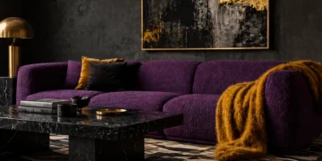
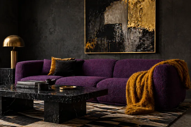
Tonal harmony. Working within the purple family – deeper plums against mid-toned violets, with lilac and dusty rose as bridge colors – creates a room that feels immersive and moody. This approach works particularly well in spaces with limited natural light, where the depth of a tonal purple palette reads as intentional richness rather than darkness. It’s unambiguously maximalist, but maximalism done with discipline has a long and distinguished history in interior design.
Complementary contrast. Purple sits opposite yellow on the color wheel, which means gold, mustard, and warm amber create natural tension and vibrancy when paired with it. This isn’t the easiest combination to pull off subtly – it takes confidence – but when it works, it produces spaces that feel genuinely alive. The key is proportion: let the purple lead and bring in the yellow or gold as accents through cushions, lampshades, picture frames, or decorative objects rather than as competing areas of color.
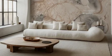
Neutral grounding. The safest and most versatile approach is to ground a purple sofa in a palette of genuine neutrals – warm whites, natural linens, stone, and aged wood tones. The sofa becomes the clear protagonist in what is otherwise a calm room. This approach has the advantage of adaptability: because the surrounding palette is quiet, the energy of the room can be adjusted over time with relatively small changes to soft furnishings and accessories.
For a comprehensive look at how these approaches translate in practice, this guide to decorating a living room around a purple sofa covers the specific color combinations, texture pairings, and layout considerations worth knowing before you commit.
Material and Texture
Color is only half of what makes a purple sofa work in a room. Texture does at least as much.
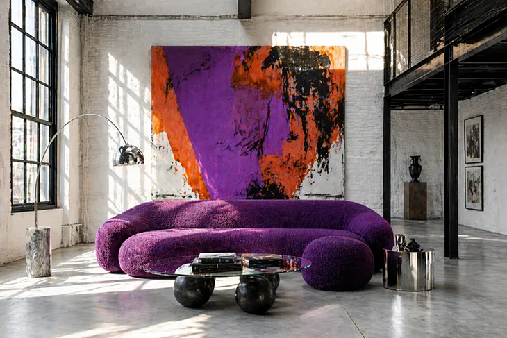
Velvet is the obvious choice, and there’s a reason for that – it handles purple with particular elegance, the pile creating a depth and luminosity that flat weaves can’t match. A deep violet velvet sofa carries a richness that reads as genuinely luxurious rather than merely colorful. The risk is that velvet can start to feel heavy in a room that isn’t balanced with lighter, airier elements – linen curtains, rattan or cane accessories, bare wood floors – to offset its weight.
Performance fabrics in purple are worth considering for spaces that get heavier use. The tonal range in high-quality performance weaves has expanded considerably, and a well-chosen fabric can hold a purple beautifully while handling the realities of daily life. The texture tends to be flatter than velvet, which means the sofa reads slightly differently – more graphic, less sensuous – but in the right room that’s not a disadvantage.
Bouclé in purple is a newer development that has been appearing with increasing frequency in design-forward interiors. The texture adds visual complexity that makes the color feel less confrontational – a purple bouclé sofa has a warmth and approachability that velvet doesn’t always offer.
What to Put on the Walls
Wall color is where many people instinctively want to retreat to safety, and with good reason – the walls surround and contextualize everything. A miscalculated wall color can either fight the sofa or swallow it.
White walls are the reliable choice, but the specific white matters. Cold, bright whites with a blue undertone can push purple towards an unpleasant coolness. Warmer whites – those with cream, pink, or yellow undertones – are more sympathetic, adding a glow that works with the sofa rather than against it.
Deeper wall colors, when handled well, can be spectacular. Painting walls in a dark forest green, a deep navy, or even an inky, almost-black creates a backdrop that makes a purple sofa genuinely sing – the sofa appears to come forward in the space, commanding the room rather than competing with it. This approach produces spaces that feel designed in a way that more cautious palettes don’t.
Earthy tones – terracotta, dusty pink, ochre – work well as mid-tones that mediate between the purple and whatever else is in the room. They’re warm, grounding, and surprisingly versatile as backdrops for bolder upholstered pieces.
The Case for Committing
The broader point about decorating around a purple sofa – and around any genuinely bold piece of furniture – is that the rooms that don’t work are usually the ones that hedge. A purple sofa surrounded by apologetic decor, everything else retreating to the safest possible choice, ends up looking like an accident rather than a decision.
The rooms that do work are the ones where the purple sofa has been accepted as the protagonist and everything else has been chosen in relation to it. That requires a degree of commitment that doesn’t come naturally to everyone, but the result – a space that has a genuine point of view – is worth considerably more than a room that plays it safe.
Color confidence is, in the end, a form of design confidence. Purple is simply one of its more visible expressions.

