


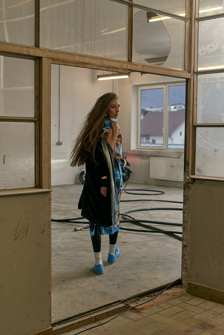
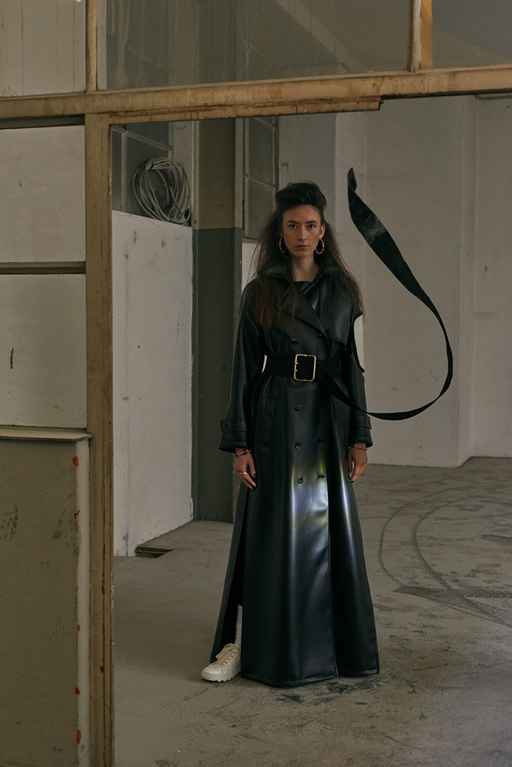
Being significant for Rebekka Ruétz‘ Autumn Winter 2020/21 creations is their powerful character paired with highly unique prints plus bold, eye-popping colours. It is, without any doubt, a great pleasure to observe the flamboyant looks of this line! However not only the prints stand out, but also the cuts. Her range of inspirations seems to be sheer endless and therefore this compelling collection has something to offer for every taste!
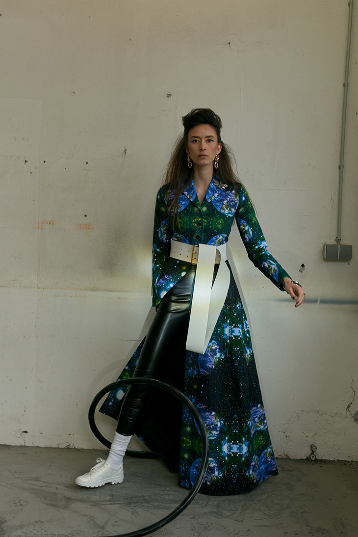
However the message behind this colourful line is a severe one: it can be understood as an ode to more environmental awareness. With this collection, the designer wants to be a good example for others and inspire her audience to focus on sustainability and care more for the environment. You may even express it rather drastically and say, Rebekka wants to save our planet- a goal that might be essential for future generations. You clearly see these influences shining through when observing the Austrian designers’ print choice: what looks so iridescent and is shimmering in rainbow colours is deceptive glory: what appears mesmerizing at first sight and shines so bright shows photographs of the pollutions of the oceans and the consequences of too much microplastic in the environment. On the other hand you may also understand the beauty of this print choice as a try to save the earth, if we can.
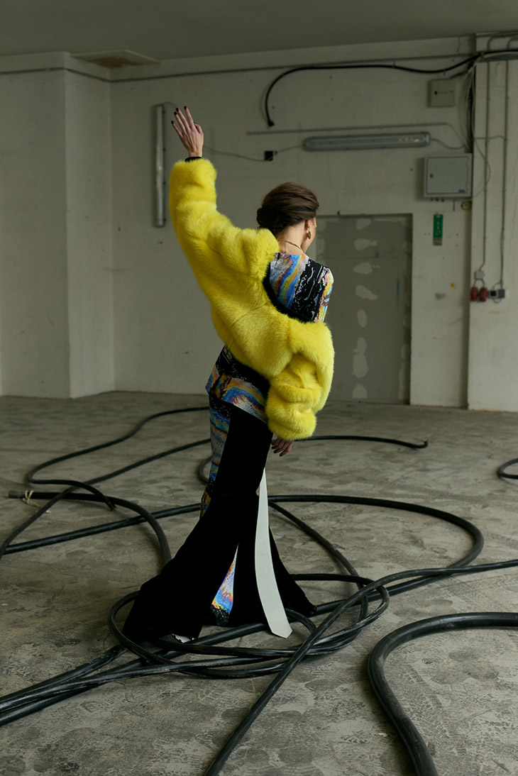
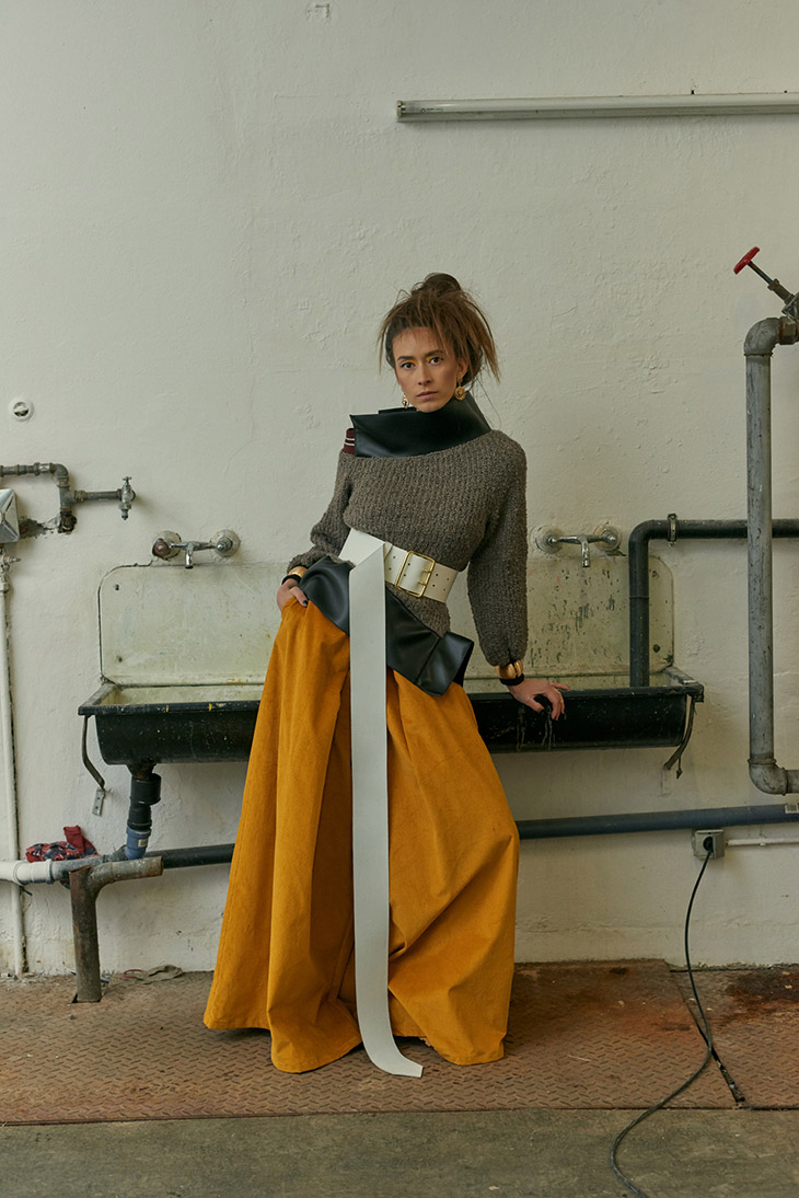
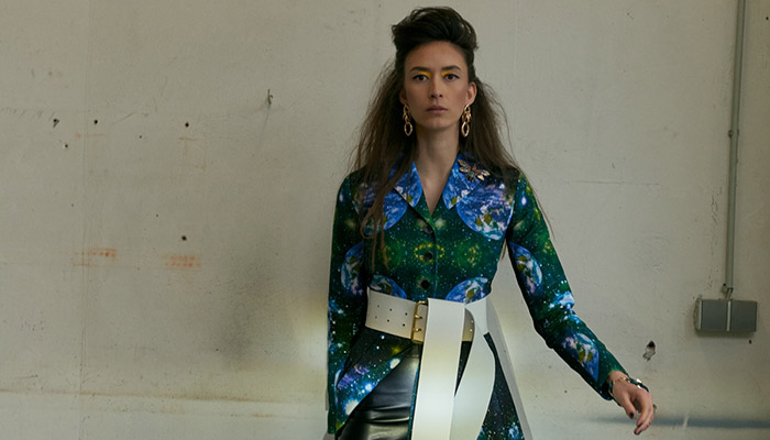
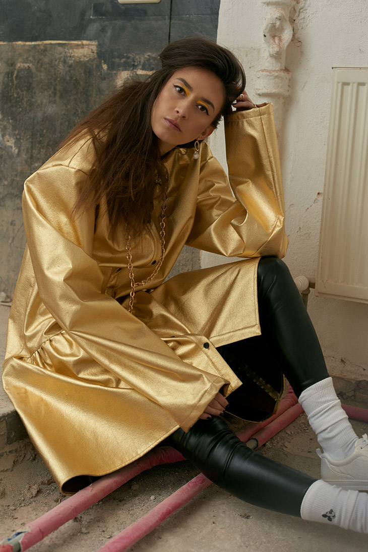
When observing the colour palette clearly, you will recognize the electric blue which is surrounded by the infinity of the universe, and then turns into seafoam and grass- green. These mysterious shades of green then transform into gloomy night black. Rich gold symbolizes the lifelines of our planet that are taken out of it. However it reminds us also of glorious days. This courageous colour gives us hope that maybe, if we all act together now for a better world, it is not too late yet. Like an artist choosing various hues from its painters’ palette, Rebekka Ruétz experiments with numerous tones. It is exactly this vivid mix and match of many, preferably bold hues, that makes these creations so full of life: yellow, tiger, saffron, mulberry are only some of the colors that are repeatedly used. In addition to that, of course ocean tones play a major role: they are ranging from turquoise, teal, shamrock, emerald green, olympic to sapphire and space. Sheer white stands for the innocence of bygone days. Rainbow nuances express pure joy of life and feel like a reminder to appreciate and save the beauty of this world.
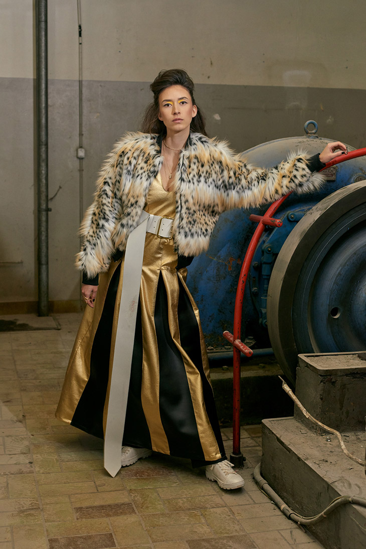
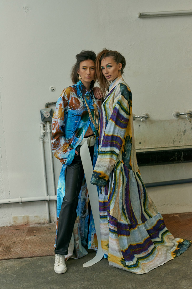
Contrary silhouettes are repeatedly paired in one look. With this collection, Rebekka Ruétz celebrates contradictions, evokes the consumers to focus on sustainability and tries to save the planet. Her unique, extravagant creations are the perfect addition for any cosmopolitan, strong womans’ wardrobe that expresses her joie de vivre by wearing vibrant colours and creations that certainly stay in mind.

Courtesy of © Rebekka Ruétz, photography by Linda Leitner
Review by Sussan Zeck for D’SCENE Magazine.


