


Another year, another colour? Not so fast, blue while omnipresent today, only three centuries ago was the most sought after possession. Pigments of colour blue as the rarest possession of all have influenced the choice of subjects by the great painters, and this rarity itself has given a whole new meaning to the use and symbolism of the colour. The history itself and the use of colour blue shows us that behind the creation of art pieces and their historical meaning stand sometimes simple reasons. Those reasons were for centuries mostly economical and have shaped the message behind some of the most important masterpieces to date. Nevertheless as we are to discover chemistry was behind it all.
The Historical Use of The Colour Blue
While blue itself is present within infinite sources around us (we see it by looking at the sky, rivers, seas and flowers around us), creating the same is a whole nother story. Going back you will literally find no blue colour in the early prehistoric art, cave drawings feature none of it. Besides a small presence of blue colour in certain flowers reproducing the same into actual blue pigment has proved almost impossible throughout the centuries. Historians claim before the discovery of certain pigments we did not even have names for many today present nuances. In addition some historians are willing to argue early colour blindness. One of the most important literary pieces to date, Odyssey a poem by Homer actually confirms this colour blindness – the ocean in the poem was described as wine-red. First pigments we were able to reproduce were black and white, followed by green and yellow, while blue lacked behind for centuries.
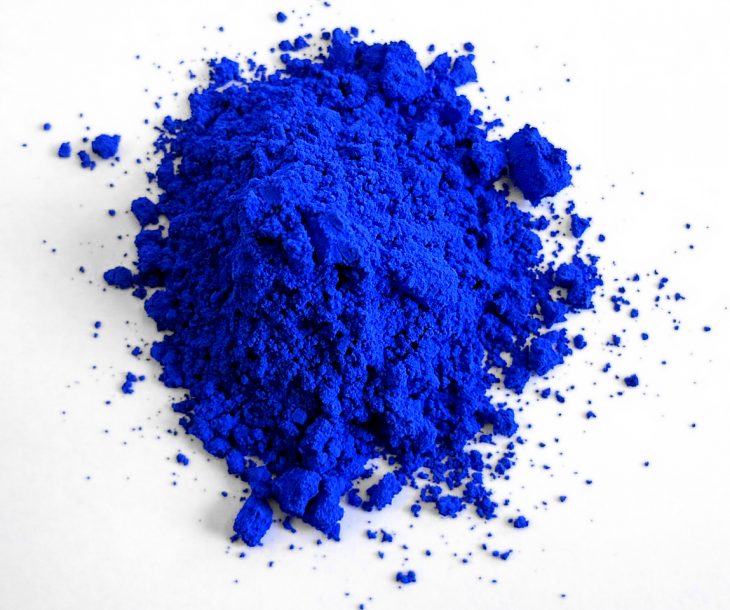
Egyptians were the first ones to master creation of the coveted blue pigment, datin back as far as 2200 BC. In a special treatment of limestone, sand and various minerals they managed to create a special powder like substance closely reflecting the colour of sky and the sea. By heating these three components to extremely high temperature the Egyptians would create a sort of a glass like material bond of undefined colour. Afterwards they would crush the glass like structure into fine powder dust and once adding up the egg yolk to the substance would turn it into colour blue. For centuries egg yolk was for artists more important than the brush itself. Egg yolk was the additive holding together and shaping the colour powders they were using.
The history itself and the use of colour blue shows us that behind the creation of art pieces and their historical meaning stand sometimes simple reasons. Those reasons were for centuries mostly economical and have shaped the message behind some of the most important masterpieces to date
This nuance of blue colour was known as the Egyptian blue and it was used to colour ceramics, statues and interior of the tombs. Still the production was a very complicated process, and even the slightest discrepancy would result in failure. In fact the formula by which Egyptians created their colour blue was guarded as a highly important secret.

Egyptian blue was one of the most important components in the empire’s export, giving away the secret would be equivalent to a modern day economic collapse. Yet according to historians the basics of the formula were actually known, however the biggest problem to create Egyptian blue was inability to produce the needed high temperature. This was an impossible task for many outside Egyptian borders who have tried and failed countless times. The colour they would get once drying would closely resemble mud, you would agree far from the coveted blue sky.

Egyptian blue quickly became one of the most desired colours in the Roman empire, and thanks to the trade agreements with Egypt the Romans had plenty of it to go around. Unfortunately with the turmoil on the crossing into the middle ages within the mediterranean civilizations and the fall of Egypt the precious production technique simply got lost. Only recently, four thousand years later, scientists were able to recreate the creation of the original Egyptian blue. The original egyptian blue actually glows under the fluorescent lighting. This was an incredibly important part of the discovery, thanks to this recent discovery the experts are able to verify the age and authenticity of recovered artifacts.
Virginal Blue
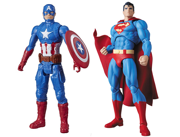
For artists working in Christian Europe colour blue was a direct connection to Virgin Mary, this was even made official by the Church. In year 431 the church created a certain colour rule book, by which each of the saints would get an assigned colour in addition to various other symbols assigned to them. Think of modern day uniformed superheroes, blue is for Captain America but also for Virgin Mary. In fact, we will get back to that connection in a bit. In addition to respecting the colour order when creating religious art the middle century artist also had to pay attention to various rules. Blue assigned to Virgin Mary will to this day in religious art represent a symbol of her good will, caringness and purity.

For centuries this symbolism of purity and righteousness was closely connected to the colour blue. Deeply from within this depiction given to the colour many countries have assigned blue colour to their national symbols but also the law enforcement. Thus today it’s hard to find a country whose police force is not wearing blue uniforms. And even in today’s comic book art, if you are a superhero saviour likely you are wearing blue spandex.
In year 431 the church created a certain colour rule book, by which each of the saints would get an assigned colour in addition to various other symbols assigned to them
Going back to the recipe, the old Egyptian blue technique while entirely lost did not leave the mind of scientists and artists trying to recreate the pigment in the middle ages. No matter how hard they would try to trace it back and repeat it there was nothing but failure on that field for millenia to come. Nevertheless what Europeans noticed is that even artisans of the time in Egypt still had other sources of colour blue . The source at this point was coming from an expensive blue stone called Lapis Lazuli. This stone was already discovered in the previous era, it was mined in the territory of today’s Afghanistan. Still while Egyptians did try to create colour out of the stone there was little success, instead the stone was widely used by jewellers of the time.
The Middle ages proved a bit more successful with harvesting blue out of Lapis lazuli and blue was finally extracted from it. The colour achieved from this precious stone to this day is known as the famed nuance of Ultramarin. The name came thanks to the route the stone would take to travel to Europe via the sea – thus ultramarinus. This was no easy road for the colour blue travelling all the way from Asia, it was often a target since it was more sought after by the robbers in the middle ages than gold itself. At one point the pigment was more expensive than the precious metal itself. In records, through all of the middle ages till the early 18th century the value of ultramarine was equal if not at times even more expensive than gold itself.
This extremely difficult trading route has made ultramarine one of the most expensive colours to date. Even if artists of the time were able to find it they would use very little of it and save it only for the most special painting. Therefore next time you find yourself in a gold clad church from the middle ages or walking through a museum wing dedicated to the art of the time, stop for a moment and look for the colour blue. Even with the dominance of gold blue you will find it saved only for Virgin Mary, an angel or two and a few out of worldly characters – the royals. With such growing importance of the blue colour Monarchs of the time could simply not get enough of it. After the state symbols and flags quickly got the touches of blue, so did the royal portraits. If a ruler was to get a portrait make sure they were to wear blue in it, thus thanks to this the term royal blue was coined.
For centuries this symbolism of purity and righteousness was closely connected to the colour blue. Deeply from within this depiction given to the colour many countries have assigned blue colour to their national symbols but also the law enforcement. Thus today it’s hard to find a country whose police force is not wearing blue uniforms
The obsession with blue lingered for centuries, at one point historians depict it as so expensive not even the most famous artists of the time could get their hands on it. Even artists sponsored by monarchs and churches such as Michelangelo Buonarroti and Leonardo da Vinci desperately struggled with the lack of blue. It is known few of his masterpieces Michelangelo abandoned not because of lack of inspiration but due to the lack of blue colour. Simply he could not afford the blue he needed to finish his pieces. While Italian Painter Raffaello Santi saved it only to colour the capes of his famed madonnas.
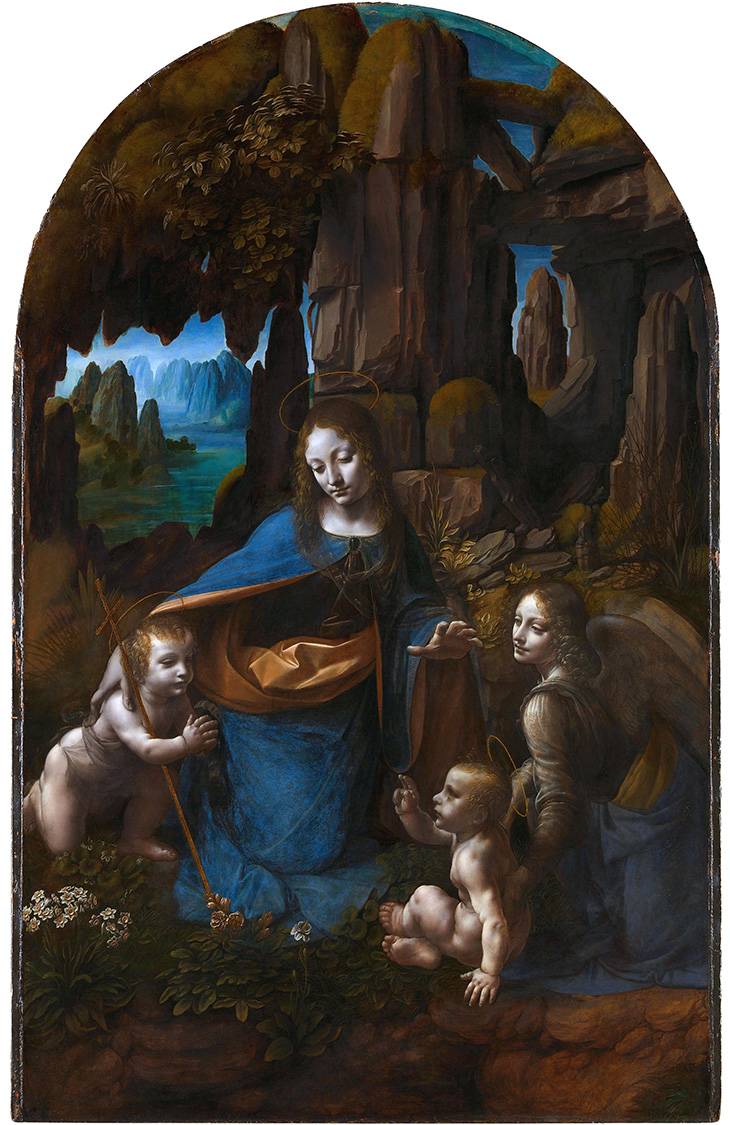
Leonardo da Vinci himself was cursed by the sparsity of blue colour. For this most famous is his work on the painting of Virgin Mary commissioned by one of the most important churches in Milan. Starting in 1483 for three years da Vinci was working on “The Virgin of The Rocks” to only desperately disappoint the church authorities. Even though today this is considered as one of the most beautiful paintings by Leonardo da Vinci the fraternity of the church was upset the artist used no blue colour spitting the strict canons of the Catholic Church. Not only did da Vinci betray by not using the colour blue he dared to remove the halos from top of the saint heads and other at that time canonized symbols. His intention on the contrary was to depict this religiously important moment of Virgin Mary and baby Jesus meeting the saints as something the people could relate to. Making sure the depiction is more out of this worldly than godly. The church authorities in Lombardy never forgave this to Leonardo, yet to make amends 10 years later Leonardo painted the same painting with the addition of colour blue for the mountains in the back and Virgin Mary’s cape. The first version is today in London’s National Gallery and the blue version is at the Louvre. In addition to Mary, for the second version Leonardo gave a bit of a blue cape to the angel as well but also gave the halos back to their saints.
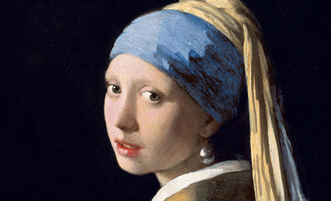
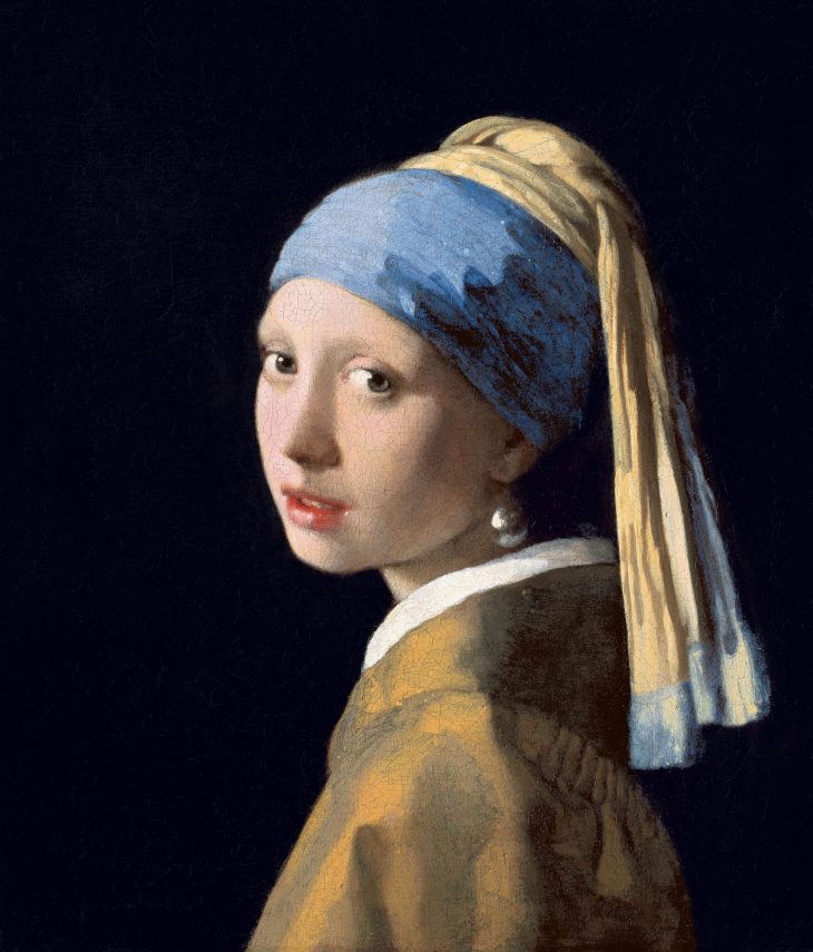
Throughout the middle ages the artists suffered and longed for the colour blue. As the story goes, the wife of the Dutch artist Johannes Vermeer was incredibly upset over his famed Girl With The Pearl Earring painting. Not only because she was jealous over her own pearl earring he gave to the maid he painted, but for spending the money the family desperately needed on the colour blue used to paint the turban worn by the girl.
STRUCK OF BLUE LUCK
Only by a stroke of luck after four millennia of colour blue being one of the most coveted possessions it all changed in a few short years. First artificial pigment of colour blue was created at the beginning of the 18th century in Berlin. That happened in a laboratory of two men, who likely today would hold a title of entrepreneurs, both were incredibly interested in alchemy.
Their names were Johann Jacob Diesbach and Johann Conrad Dippel. The later one as the story would tell was working on creating a universal potion to cure all of the diseases known to mankind. This ambitious project was called Oleum Animale by it’s creator, simply said animal oil so therefore he kept distilling animal blood over and over and over again in his laboratory. To create this magical potion he would keep adding up a sort of a fertilizer known at the time. While his business partner Diesbach was the more practical one of the duo, and was actually very well known for creating a very good red colour pigment. His red was created by a murky mix of water used to boil all kinds of insects, acid, aluminium sulphate, iron sulphate and potassium based fertilizer. At one point he was out of fertilizer so without asking he borrowed some from his colleague not knowing this fertilizer was already saturated with animal blood. The moment he mixed it in, his red quickly started changing colour into a purple like substance, then dark red, pink and in the end blue!
Extremely cheaper prussian blue has made the expensive ultramarine a fragment of the past
The duo needless to say thrilled by their accidental discovery named the colour Prussian Blue. Historians are tracing it back to documentation from 1708. While it may seem as easy there was a lot of complication for Diesbach and Dippel, at one point they were about to be prosecuted by the church. Dippel left Berlin and travelled to Holland where he started producing the Prussian Blue on his own. The formula was closely guarded by it’s creators for more than two decades.
Then, John Woodward, an English naturalist, antiquarian and

Furthermore, this extremely cheaper prussian blue has made the expensive ultramarine a fragment of the past. This wide availability of the blue colour has soon after resulted in the colour losing also it’s importance and exclusivity. With what was once an exclusive right of the royals and saints during 18th and 19th century artists just couldn’t get enough of blue. Artworks of the time are incredibly rich in blue colour, with entire life works of some artists were dominated by it. Some of the most famous artworks such as Van Gogh’s The Starry Night and Hokusai’s The Great Wave off Kanagawa are to this day part of contemporary culture thanks to their blue depictions. Both are the result of the suddenly available prussian blue.
THE CONTEMPORARY BLUE
Art world of the 20th century was equally as impressed with the colour blue. One could say it starts with the blue period of Pablo Picasso, this period for the artist lasting from 1901 till 1904 was incredibly melancholic. It is considered as one of the most saddest moments in the artist’s opus, he was depicting outlaws, baggers, drunkards and prostitutes. Picasso’s sadness also came from the death of a close friend. Since then the colour blue is often depicted as a somber one, and blue itself is to this day used to describe a sad feeling – feeling blue.
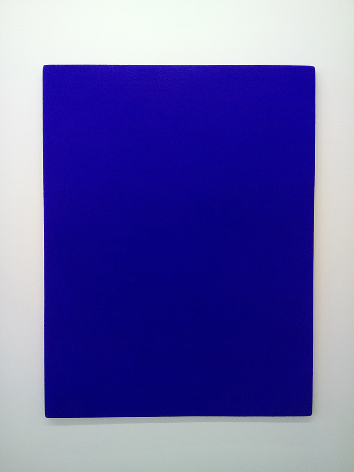
Blue came back on the art scene in the 2nd part of the 20th century thanks to the French contemporary artist Yves Klein who is celebrated for his monochrome blue canvases. In the mid 50s thanks to his collaboration with a chemist, Klein was able to create a special nuance of blue. This very saturated version of it was described by the artist as the most perfect shade of blue and he protected the same under his name as The International Klein Bleu or IKB.
His blue era Yves Klein started in 1957 at a gallery in Milano, where he exhibited only blue canvases depicting nothing but monochrome colour blue. His monochrome canvases thanks also to his original nuance are now instantly recognizable around the world. Klein famously shared: “Blue has no dimensions, it is beyond dimensions, whereas the other colours are not. They are pre-psychological expanses, red, for example, presupposing a site radiating heat.“
To this day artists and chemists alike are fascinated by the colour blue. The latest version was also discovered by accident. It happened in 2009, at University of Oregon. The YInMn Blue also known as Oregon Blue or Mas Blue is an inorganic blue pigment that was created by chance by Professor Mas Subramanian and his student Andrew E. Smith. YInMn in the name stands for yttrium, indium, manganese contained in the colour, which was created from a metal substance the scientist and his student were working on. In 2016 various companies started the commercial use of the colour. Crayola who bought the first right for the colour soon after started looking for a more commercial name for the colour and with the help of the public they came up with Bluetiful as a more well beautiful name.
Finally, we have to mention the idea of blue colour today for many is connected to a boy colour. Yet this notionas is fairly novel, and it started only after world war two. With the baby boom following this was actually a commercial gimmick by the garment industry. In fact, in the decades before boys were the ones mostly dressed in pink. The popularity of blue colour is to this day unparalleled. The above mentioned bluetiful is only one of the names it has, the testament to its popularity is the fact that through various languages there are over hundred different names for the shades of blue.
Words by Zarko Davinic, originally published in issue 13 of DSCENE Magazine “True Blue” issue.
