


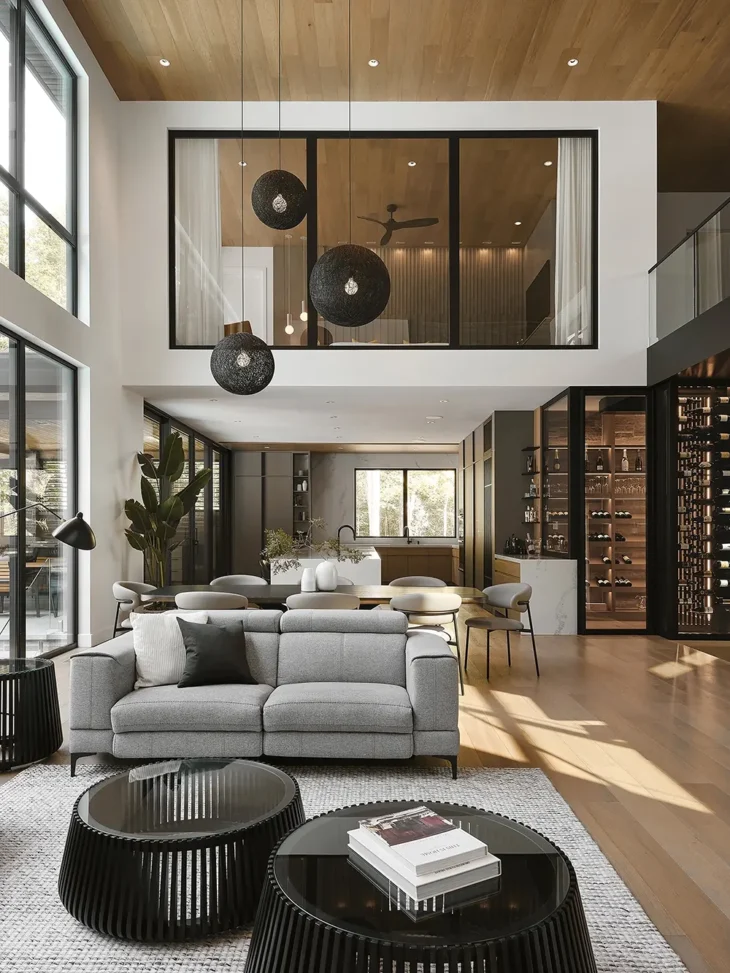
Ask anyone to describe a room they love, and they’ll probably mention the light, the ceiling height, or the view. The floor rarely gets a second thought. Yet it’s the largest unbroken surface in most rooms, and it has a big say in how spacious and how bright a space feels. Architects have known this for centuries. Grand halls were laid with patterned oak for a reason. Today, designers use plank direction, scale, and tone to correct awkward layouts without moving to a single wall.
So, how does flooring shape the architecture of a room, and how can you make it work in yours?
Plank Direction Changes the Proportions
The way your boards run costs nothing extra, but it’s one of the most powerful decisions you’ll make. Lay planks lengthways down a long, narrow room and you’ll stretch it even further. That’s great in an entrance hall where you want a sense of arrival. It’s less great in a galley kitchen that already feels like a corridor. Turn those same planks across the width and the walls appear to push outwards. Then there’s daylight. Running boards towards the main window means the joins follow the light instead of catching it. The surface looks smoother and the lines between boards almost disappear.
In open-plan spaces, keeping one direction throughout ties the kitchen, dining, and living areas together. Changing direction between zones can work, but it needs to look deliberate. Not like the fitter ran out of patience.
Getting the Scale Right
Plank width works a lot like furniture. Too small and it gets lost. Too large and it takes over. Wide planks, around 180mm and up, suit generous rooms with high ceilings. Fewer joins mean less visual noise, so the room feels open and settled. In a period property, wide planks also echo the original floorboards and the tall proportions of sash windows. Narrower boards add rhythm. They’re a smart pick for smaller rooms, where the extra lines break up the surface and stop the floor looking like one flat sheet of colour.
Length matters too. Long boards make a room feel more expansive, while shorter lengths laid in a random pattern bring texture and a more lived-in character.
Colour Sets the Tone (and the Height)
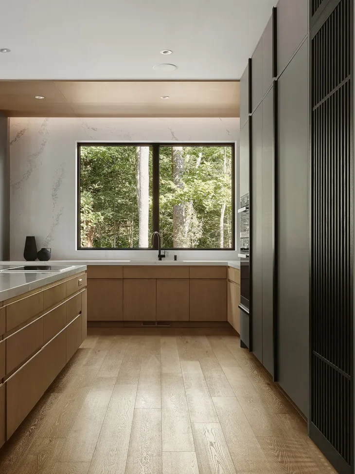
Colour is where flooring starts to play with light. Designers and architects measure this with light reflectance value: a scale showing how much visible light bounces back from a surface. The higher the number, the more light comes back into the room. Pale oaks, soft greys, and whitewashed finishes push light up onto the walls and ceiling. That’s why they’re so popular in north-facing rooms and compact city flats. The room reads as bigger because there’s less shadow sitting at its base. Darker floors work differently. A rich walnut or smoked oak anchors a room and makes pale walls look crisper by contrast. In a large space with plenty of daylight, that contrast adds structure. The walls and ceiling feel clearly defined, almost like a frame.
The relationship between floor and walls matters more than the floor on its own. A light floor under light walls creates a soft, open box. A dark floor under light walls lifts the ceiling. And a floor that matches the walls too closely can leave a room looking unfinished, as if nothing quite has its place.
Parquet Patterns Bring Their Own Architecture
If plank direction is a quiet nudge, parquet is a statement within your interior design. Patterned floors have been an architectural feature for centuries. When Louis XIV turned his hunting lodge at Versailles into a palace, he had parquet laid on a scale never seen before. And palaces across Europe then copied it. Each pattern behaves differently in a room too. Herringbone’s zig-zag adds movement. When laid along the length of a hallway, it pulls you through the space. When laid diagonally, it can make a boxy room feel wider than it is. Chevron is more directional. Its blocks meet at a clean point, creating arrows that lead towards a fireplace, a window, or a view. Use it where you want people to look. Versailles panels and basketweave patters are more static. They give a room a strong centre, which suits formal dining rooms and generous reception spaces.
The joy of modern parquet flooring is that you don’t need a palace to pull it off. Engineered wood, laminate, and luxury vinyl versions mean the look works everywhere. Block size matters, though. Small blocks in a small room can look busy, so it’s best to scale up if you’re short on space.
Continuity and Zoning
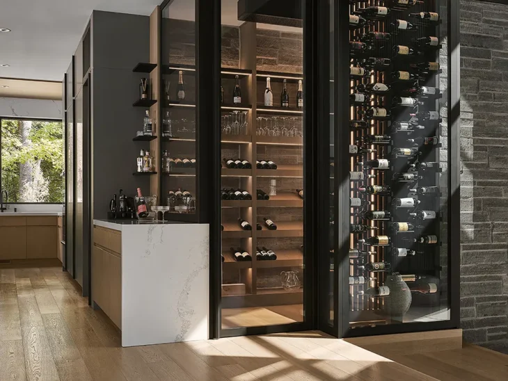
A floor that carries on from one room into the next starts shaping the whole layout, not just a single space. Running the same floor through connected spaces removes visual breaks. A ground floor laid in one oak from front door to garden doors feels larger and more joined-up than one split into four different finishes. Threshold strips and changes in level stand out much less when the floor on either side matches.
In open-plan layouts, flooring can do the job walls used to. A herringbone panel under the dining table marks out a space without blocking light. A border of plain boards around a patterned centre frames a living area. Even a change in direction can signal where the kitchen ends and the sofa begins. The trick is restraint. Two finishes in one open space can define zones. But three or more usually just look like a patchwork and can be a bit too busy on the eye.
Start From the Ground Up
We tend to treat flooring as the last box to tick in a renovation. But it’s often the first thing that decides whether a room works. Before you choose a colour or a pattern, stand in the doorway and ask what the room needs. More length? More width? A focal point? More light? Answer that and the right floor becomes easier to find.
If you’re still unsure, order a few samples and lay them down in different directions and lights flooring trends are always changing but floors are not something you should choose as quickly. You’ll be surprised how much a few boards can change the shape of a room.