


Fashion’s relationship with color has never been more digital. Pantone libraries, screen-calibrated swatches, mood boards assembled in Figma at 2 AM. Yet somewhere between the infinite scroll and the hundredth hex code, something gets lost: the physical intuition for how colors actually behave together.
Enter watercolor moodboarding, a deceptively simple practice that’s gaining quiet traction among stylists, designers, and creative directors looking to reconnect with color as material rather than data. The barrier to entry is lower than you’d think: ten minutes, a few basic supplies, and zero expectation of creating anything frameable.
Why Watercolor Works for Fashion Thinking
Watercolor isn’t about illustration skill. It’s about watching pigments interact in ways no RGB slider can replicate.
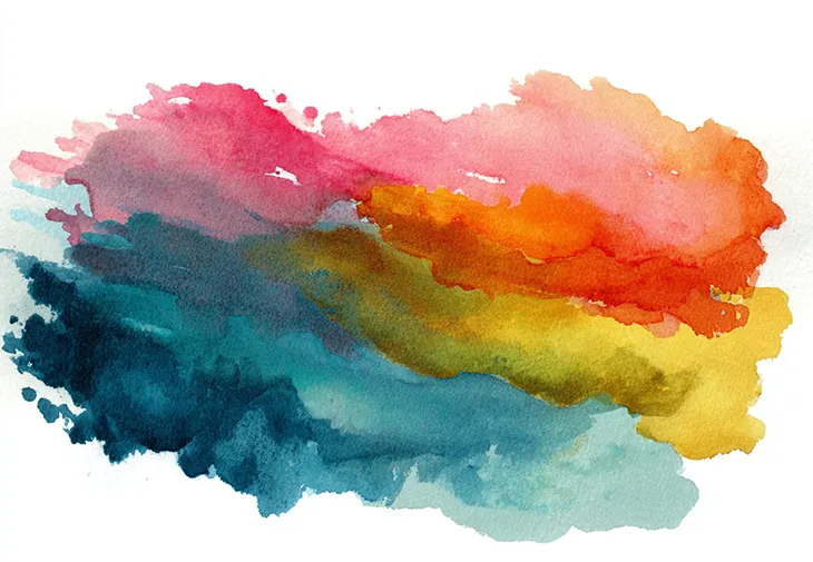
When you layer a wash of burnt sienna over a dried cobalt base, you’re not making “art.” You’re conducting a color experiment. The transparency of watercolor mimics how fabrics absorb and reflect light. A wet-on-wet blend approximates the way silk catches a gradient. Three quick brush strokes can suggest denim’s weight versus linen’s airiness without drawing a single accurate fold.
This matters because fashion decisions happen in physical space. A collection palette that sings on a mood board can fall flat on the rack. Watercolor forces you to see color as dimension: how it bleeds, how it settles, how it surprises you. Fast iteration replaces perfectionism. You’re not committing; you’re questioning.
The practice also sidesteps the “finished product” pressure that kills most creative habits. A watercolor study is inherently rough. That’s the point.
The Starter Setup That Avoids Supply Overwhelm
The fastest way to abandon any analog practice is to overcomplicate the materials. Walk into an art store for watercolors and you’ll leave with seventeen tubes, three palette options, and a stack of paper you’re suddenly afraid to “waste.”
The essentials are simpler: a compact palette with a reasonable color range (twelve pigments covers most needs), a water brush that eliminates the cup-and-rinse cycle, and paper thick enough to handle moisture without buckling. That’s it.
Brands like Tobio’s Kits are leaning into portable, beginner-friendly sets that reduce setup friction, so the habit actually sticks. The appeal isn’t about premium materials; it’s about removing every excuse between you and ten minutes of color play. Desk-ready, travel-ready, no cleanup spiral.
If you’re testing the practice before investing, start with whatever you have. But if supply paralysis has killed your past attempts at analog creativity, a contained kit solves the decision fatigue problem.
3 Micro-Exercises to Start This Week
Forget tutorials that require “following along.” These are prompts, not prescriptions.
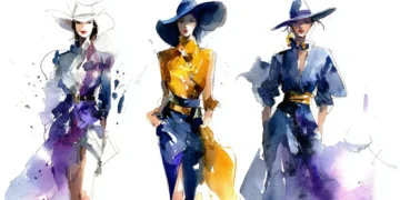
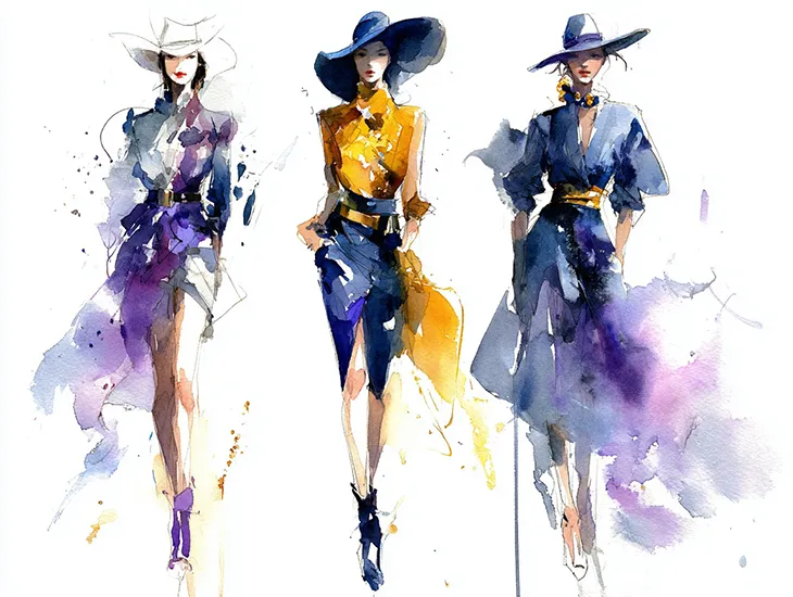
Silhouette wash. Pull up any runway image. Reduce the figure to a single shape, no details, no features. Fill it with the collection’s dominant color, then add one neutral (grey, ochre, off-white) while still wet. Watch where they meet. That edge behavior tells you something about the palette’s tension.
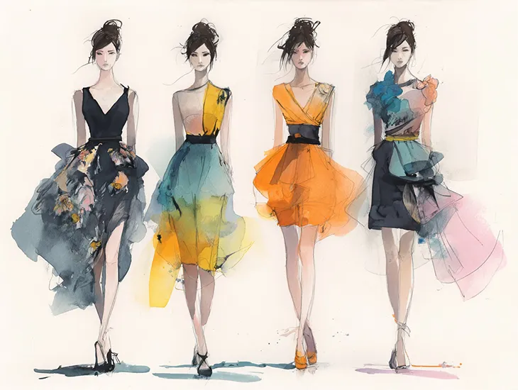
Accessory colorway study. Pick one item: a bag, a shoe, a pair of sunglasses. Paint six versions in six different color combinations, keeping each to under two minutes. No blending, no fixing. You’re generating options, not outcomes.
Texture blocks. Abstract this one completely: satin as a smooth gradient wash, denim as a dry-brush scrape, leather as a single saturated shape with hard edges. You’re not painting fabric. You’re noting how your brain translates material into gesture.
None of these need to “look like” anything. They’re thinking tools, not portfolio pieces.
How to Make It a Weekly Ritual
The practices that survive are the ones with zero friction. Same time, same place, same minimal setup.
Pick a weekly window: Sunday morning before the screen takes over, Wednesday lunch at your desk, Friday wind-down. Treat it like a meeting that doesn’t require preparation. The prompt can be as simple as “paint the colors you saw today” or “recreate a palette from a film still.”
Visibility matters. If your supplies live in a drawer, you won’t reach for them. A kit that sits on your desk, closed but present, becomes a visual cue. The practice stays in your peripheral awareness until it becomes automatic.
Ten minutes is enough. Longer sessions happen naturally once the resistance dissolves, but building the habit matters more than building the skill.
Sharing Without the Pressure
Most people abandon creative side practices because they feel compelled to document them, and documentation demands performance.
If you want to share, keep it low-stakes. Photograph in natural light, crop tight to hide the mess around the edges, and write one sentence about what you were thinking, not what you achieved. “Testing a palette from the Bottega show” is more interesting than “my watercolor practice.”
Better yet, don’t share at all. Let the work exist as process rather than content. Fashion creatives already produce enough output for public consumption. A private color practice can stay private.
The pitch here isn’t that watercolor will make you a better designer or unlock hidden artistic talent. It’s smaller than that: ten minutes of watching pigment move across paper can recalibrate how you see color for the rest of the week.
In an industry obsessed with the new, there’s something useful about a medium that’s been doing the same thing for centuries. The water still blooms. The colors still bleed. And your eye still learns something it couldn’t learn from a screen.


