


Google Design found that expressive design can make products feel more modern, relevant, and desirable, while helping users spot key elements faster. The catch is control. Expression works only when it sharpens the experience instead of competing with usability, accessibility, and familiar patterns.
Val Pavliuchenko, founder and CEO of Hosanna Studio, is the kind of designer companies seek when standard interface design is not enough. He knows how to turn complex technology into a clear, premium digital experience that helps companies communicate value, earn trust, and stand out. Built around controlled expressiveness, his approach gives products a distinct visual character while protecting usability, hierarchy, and function across automotive UI, airline platforms, commerce tools, AR-related concepts, and emerging technology products.
He helped OPPO shape the visual language of an automotive system and defined the visual direction for an AR-related Mitsubishi project. For Scandinavian Airlines, he contributed to the redesign of an outdated digital experience through modern UX/UI, loyalty-related features, and a more premium visual standard. For Google Merchant, he brought precision to guideline-driven interface and illustration work. Across projects connected with NEAR Protocol, Neon by Samsung, Star Labs, and Natural OS by Brain Technologies, Val has shown why his value goes beyond execution: he defines how advanced technology should look, feel, and speak to the people it is built for.
Val, you often deal with expressive interfaces, but not in the decorative sense. What does controlled expressiveness mean to you?
It means using strong visual decisions only when they make the product easier to understand, easier to remember, or easier to position. It is choosing exactly where the interface should be visually distinctive and where it should stay quiet.
A lot of teams working on advanced products add too many effects at once: glow, motion, 3D, dark gradients, atmospheric backgrounds. The result may look impressive in a presentation, but in the actual interface the user has to spend more effort understanding what is important and what they should do next.
Before founding Hosanna Studio, you took on a lead role across major international design projects. Today, your own studio is built around the standards you developed there and refined independently. Which principles became non-negotiable for you when you began leading design under your own name?
I do not believe in judging a design direction by its best screen. See, a hero screen can hide almost anything. It has perfect text, perfect spacing, perfect composition. Then the product grows, and the same direction has to handle a dashboard, a mobile version, a loading state, an error, an empty state, a settings screen, and a screen with too much information. That is where the real quality shows.
At Hosanna Studio, I want to see the uncomfortable screens early. If the visual language works only when everything is cinematic, it is still fragile. If it works in the boring parts of the product, then we can build from it.
Another rule is that effects need responsibilities. Motion should move attention. 3D should help the product feel clearer or more tangible. A dark interface should still be readable. A premium product cannot rely on mood alone.
When you begin shaping the visual direction for a large digital product, especially one that may grow into many screens and touchpoints, where do you start?
I usually start with the places where the product will be under pressure. For example, a product may have a beautiful landing screen, but what happens inside the dashboard? What happens when the user has no data yet? What happens when there are too many cards, filters, warnings, or controls? What happens when the same idea has to work in a product demo and on a small mobile screen?
Those moments tell me more than a moodboard. They are useful for atmosphere, but can make a team fall in love with the wrong thing. A reference can look perfect because it has no business logic inside it.
You are often invited to projects where a company needs more than a clean interface. It needs a design language that can change how the product is understood and valued. What separates competent UI from design that can shift a company’s market perception?
People judge digital products faster than companies think. Before the full explanation begins, the interface has already said something. It can make the company feel mature or unfinished. It can make a complex product feel controlled or overwhelming. It can make a young technology company look like it belongs in a higher category.
Competent UI helps the user complete a task. Stronger design changes the level of confidence around the product. A founder opening an investor-facing demo should feel that the interface supports the ambition of the company. A customer seeing the product for the first time should not need to work hard to understand why it has value.
That first impression is not everything, but it sets the tone.
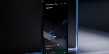
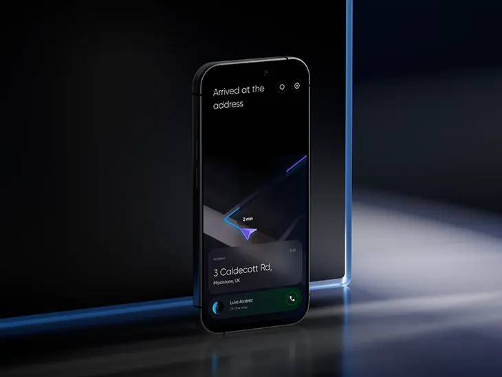
You shaped the visual shell of an Android alternative to CarPlay for OPPO, a global smart device company, directly affecting how the system was seen, understood, and used by thousands of consumers. What changes when expressive design enters the car?
Everything becomes stricter. The screen cannot behave like a portfolio piece. The driver is not there to admire a composition. So the main information has to be visible immediately. Icons need to be recognizable, not overly clever. Motion should help the driver understand that something has changed, not pull attention away from the road. Contrast has to hold up in different lighting conditions, and the locked screen should feel calm rather than visually busy.
However, there is a challenge: UI cannot look generic. It must be unique. Especially for a technology brand. But the futuristic feeling should come from control: clean hierarchy, confident spacing, precise motion, good density.
One of your distinctive abilities is to give technology a visual language before the market has fully learned how to read it. Through Hosanna Studio, where you direct UI, art direction, WebGL, 2D, and 3D work, how do you make a future-facing product feel advanced without making it feel like a concept video?
I try to ruin the beautiful version early. I remove the perfect conditions, look at it without the cinematic animation, then put it on a smaller screen. I also place it next to a normal product table or a simple onboarding step. I try to imagine someone opening it on a weekday.
That usually shows the way everything works. A WebGL layer can be impressive, but if it slows down the product story, it is not helping. A 3D object can be beautiful, but if the user is looking at the object instead of understanding the action, it is in the way. Motion can make a product feel expensive, but it can also make every step feel delayed.
So I treat advanced visuals as part of the product logic. They have to help the user enter the product, recognize its value, or understand its world faster. Otherwise, they are only decoration with better technology.
As the founder and creative lead of Hosanna Studio, you direct different specialists around one visual standard, from UI and motion to 2D and 3D. Why is such direction important when a company needs a product identity?
Because different specialists can all do good work and still create a confused product.
A 3D designer may want more atmosphere. A motion designer may want a more expressive transition. A UI designer may want to simplify everything. An illustrator may bring another emotional tone. None of them is wrong. But if nobody is directing the whole language, the product starts to lose its center.
My role is to decide what belongs to the world of the product. How much depth is allowed. How sharp the motion should be. Whether the icons should feel quiet or distinctive. Whether the 3D layer is part of the interface or mainly part of the brand experience.
Product identity is not one beautiful asset. It is the feeling that the opening screen, the dashboard, the mobile state, the product page, and the demo all came from the same intelligence.
Clients often come to external design studios when internal teams cannot reach the level of visual distinction they need. What kind of designer can create that future-facing direction while keeping it commercially usable today?
A designer who can do that has to combine strong visual taste with product discipline. It is not enough to create an impressive style; the direction has to be tested against real product situations. I usually look at the opening screen, because the product has to become clear in seconds. A dense dashboard shows whether the hierarchy can handle data, filters, alerts, and competing priorities. Mobile exposes whether the idea is a real system or only a wide-screen composition. In a product demo, the interface has to help the company explain value without extra verbal support. Empty states matter as well, because when there is almost no content, weak visual language becomes obvious. The right designer can push the product into a more advanced visual category, but still make sure it works for customers, investors, sales teams, and everyday users.

