


Before a lipstick touches skin or a jacket is tried on, the customer has already formed an opinion. It forms in the hand, at the moment a compact clicks shut or a shopping bag swings from a wrist. In beauty and fashion, packaging is not an afterthought to the product. It is frequently the most recognisable part of the brand: the element that photographs best, travels furthest and stays in view the longest.
Some of the most enduring images in fashion and beauty are not garments or formulas at all, but bottles, boxes and bags. That is no accident. Packaging is where a brand’s visual identity stops being an idea in a style guide and becomes an object someone can hold.
The Most-Handled Surface a Brand Owns
A serum bottle is picked up every morning and evening. A fragrance sits on a dressing table for months. A make-up pouch is opened in office bathrooms, train carriages and hotel rooms. Few advertisements achieve that kind of frequency. Packaging is the surface of a brand that people actually live with, which makes it a design priority rather than a production detail.
This repeated contact changes how designers think. The weight of a cap, the resistance of a pump, the soft snap of a magnetic closure: these tactile qualities become part of the identity just as surely as a logo. Customers may never describe them, but they remember them.
Colour, Type and the Grammar of Recognition
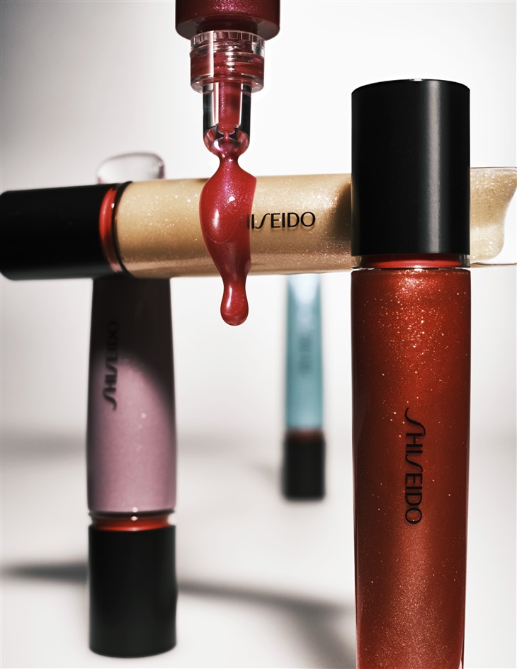
Visual identity in beauty and fashion depends on being recognised at a glance. On a crowded shelf or a fast-moving feed, a brand has a fraction of a second to register. Colour does much of that work. A single shade, applied with discipline across every touchpoint, can become so closely tied to a label that the name hardly needs to appear.
Typography carries the tone of voice. A delicate serif suggests heritage and refinement; a bold, condensed sans-serif in capitals feels contemporary and direct. Restraint is often the strongest choice. Many of the most memorable packages carry very little text, trusting proportion, white space and one confident mark to do the talking.
Material as Message
Materials communicate values before a word is read. Heavy glass implies permanence and indulgence. Frosted finishes soften a product’s presence and hint at calm. Recycled board with visible fibres signals a brand that wants to be seen as considered and responsible. Soft-touch coatings, foil details and embossing each add a layer of meaning, and each works best when used with intent rather than as decoration.
The real challenge is coherence. A clean-beauty label housed in glossy plastic with metallic foil sends mixed signals. A luxury fragrance in thin, lightweight packaging undermines its own price. The strongest identities align material, finish and message so the package feels like a natural extension of what sits inside it.
Structure: When Shape Becomes Signature
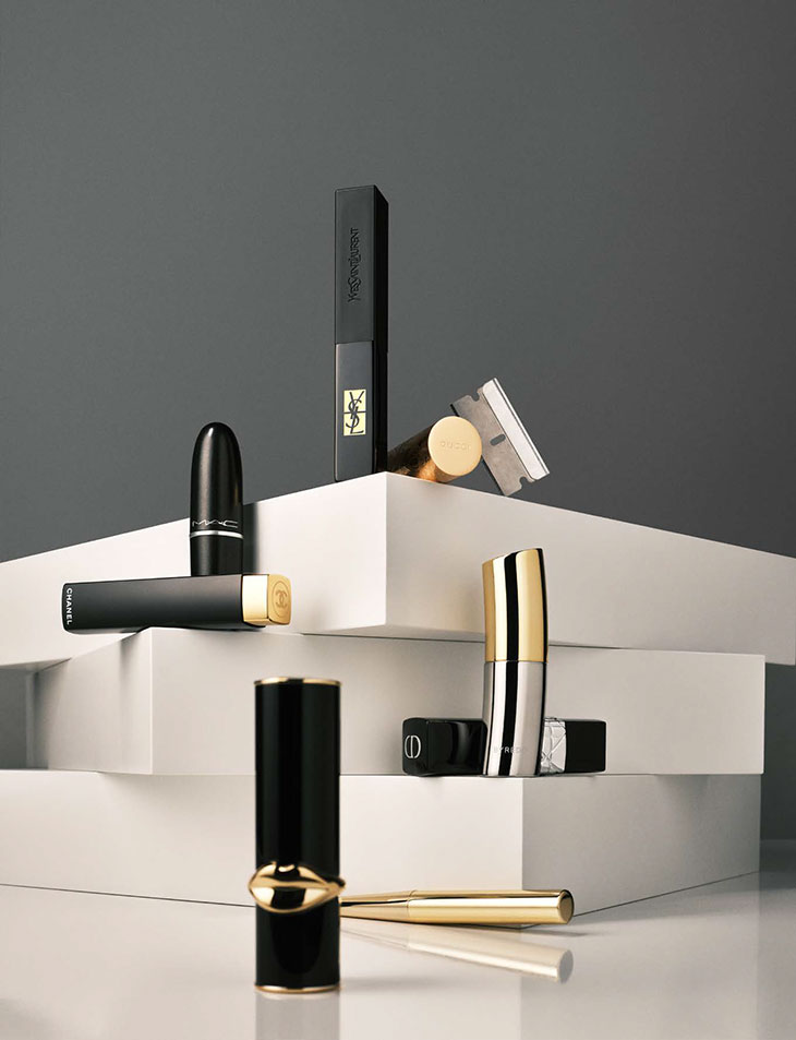
Beyond surface, there is form. Shape is one of the hardest identity elements for competitors to imitate convincingly and one of the easiest for customers to recall. A distinctive bottle silhouette, an unusual compact mechanism or a box that opens in an unexpected way can become as identifying as any wordmark.
For emerging labels, structural ambition once felt out of reach, because tooling costs and long production runs favoured established houses. Today, sourcing custom packaging from specialist manufacturers makes it far more realistic for younger brands to commission boxes, inserts and outer cartons built around their own proportions instead of borrowing from a stock range. Primary containers are a separate discipline again: jars, droppers, tubes and bottles must protect formulations, dispense accurately and still look the part. Suppliers such as Paking Duck, whose range includes cosmetic packaging alongside paper-based boxes, make it possible to develop both layers in conversation with each other, which tends to produce a more unified result.
From Shelf to Screen to Vanity
Packaging now performs in three settings at once. On the shelf, it must hold its own among competitors under harsh retail lighting. On screen, it must photograph well in flat lays, unboxing videos and close-up product shots, often taken on a phone. On the bathroom counter or dressing table, it must look good enough to be left out rather than hidden in a drawer.
Designing for all three demands discipline.
Fine detail that delights in the hand can vanish on a small screen. Highly reflective finishes can look striking in person and muddy in photographs. Testing prototypes in real conditions, in daylight, under shop lighting and through a phone camera, reveals problems that a digital mock-up never will.
Fashion’s Paper Trail
In fashion, packaging extends into a whole family of objects: shopping bags, tissue paper, garment bags, mailer boxes, hangtags and care cards. Each is a small opportunity to reinforce identity. A well-made carrier bag is reused for months, turning into a moving advertisement on the street. A hangtag with a tactile stock and a considered typeface tells the customer something about a garment’s quality before they read the composition label.
As more fashion is bought online, the mailer has quietly replaced the boutique as the first physical meeting point between brand and customer. Labels that treat it with the same care as a shop interior create a far stronger first impression than those that rely on plain grey polythene.
Sustainability as a Design Discipline
Environmental expectations are now part of the brief rather than a separate conversation. Refillable formats, mono-material constructions that are easier to recycle, reduced ink coverage and right-sized shipping boxes all shape how packaging looks. Far from limiting creativity, these constraints often produce cleaner, more confident design. A brand that can make a recycled paper box feel luxurious has achieved something more interesting than one that simply adds another layer of foil.
Finally, in beauty and fashion, the package is where identity becomes tangible. It is held, displayed, photographed and, at its best, kept. Brands that treat packaging as a core part of their visual language, aligning colour, type, material and structure with what they stand for, earn a kind of recognition no single campaign can buy. Those that treat it merely as a container leave one of their most powerful design tools unused.
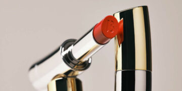
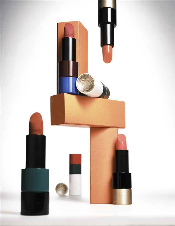
Images from Red Lipstick as the Defiant Icon of Feminism – see full article here.